Rebuilding talent search at Reejig
I rebuilt Reejig’s talent search so talent managers and recruiters could find the right people without needing Boolean syntax or understanding the black box behind the results.

Snapshot
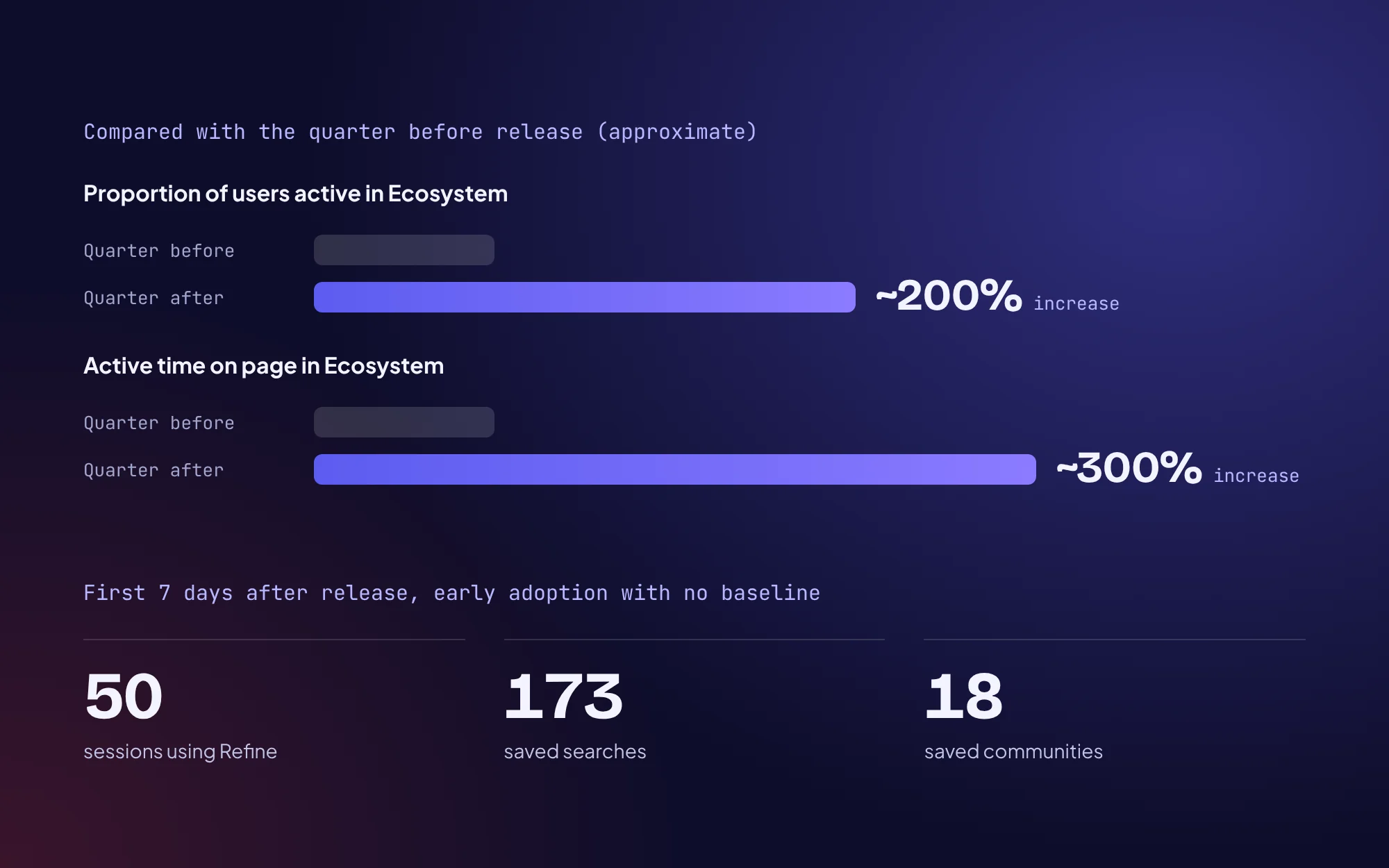
About a 200% increase in the proportion of users active in Ecosystem, quarter on quarter, after release.
- Role
- Senior Product DesignerThe only designer on the squad, and acting PM for the back half of the project.
- Company
- Reejig, a post–Series A workforce intelligence scale-up (around 60–70 people, around 15 enterprise customers)
- Team
- Me, a front-end engineer and a back-end engineer, working closely with data science and machine learning.
- Timeline
- November 2022 to March 2023, released before I left
Context and the real problem
Search was already on the roadmap when it landed with me, and the brief was pretty much “fix search”.
The stakes
- CS was overloaded with search tickets.
- Customers kept hitting walls without understanding why results behaved the way they did.
- CS was doing their best to support adoption and smooth things over, but the gaps were obvious, and that uncertainty was felt just as much inside the company as by customers.
“Also the fact that I have to type in San Francisco into Reejig drives me nuts. I didn’t even know there was another one and that’s like the worst word to type.” (Reejig user)

How I reframed it
- There was no documentation of how search worked, and nobody on the squad could fully explain why a query returned what it did.
- The team’s habit was to do customer research, but not to dig into where the data came from, how it was transformed, or how the ML and ranking shaped results.
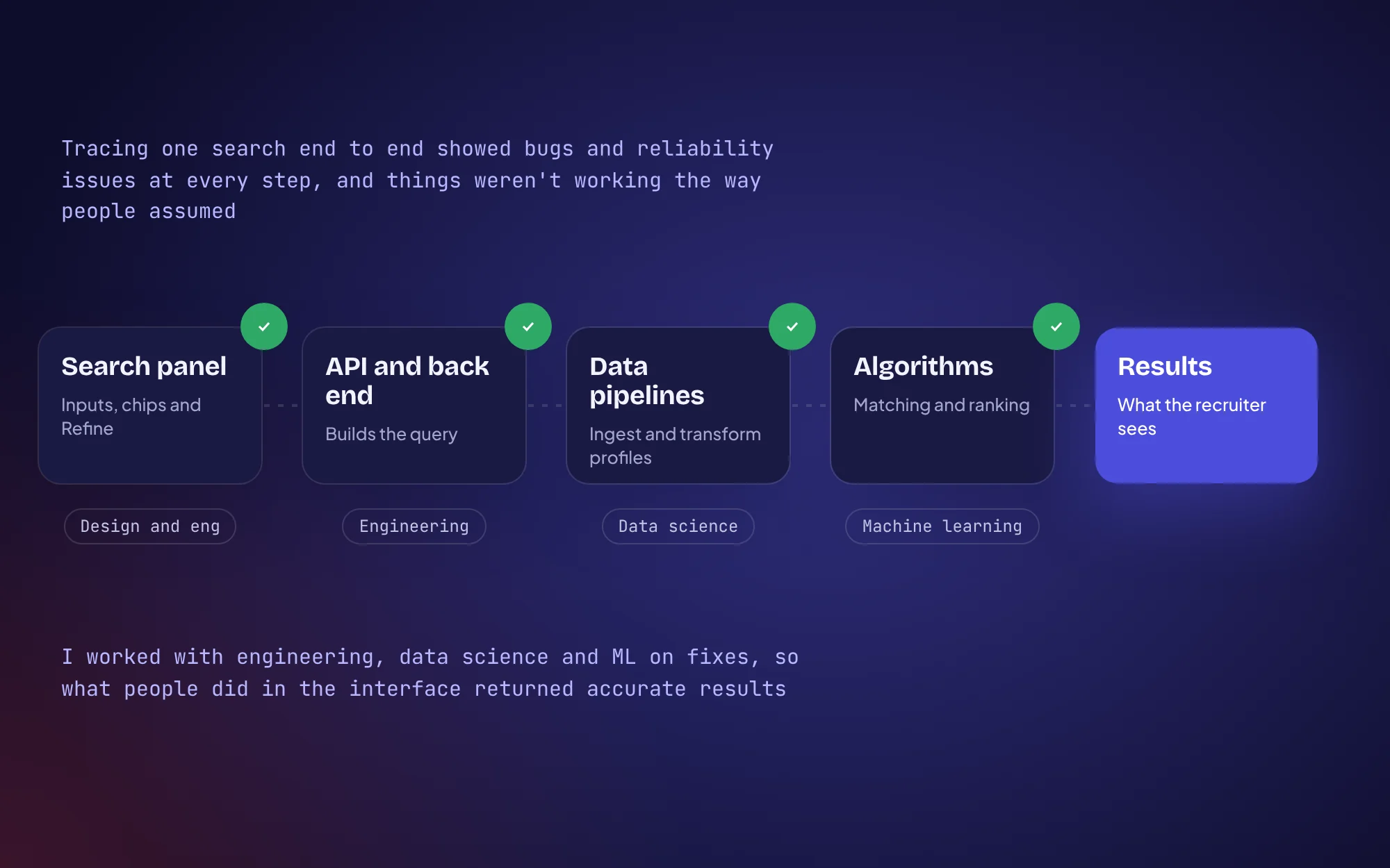
- I pushed for time with data science, ML and engineering to trace that whole flow before designing anything. Users’ core frustration was that search felt unpredictable, and I couldn’t design clarity on top of a system none of us understood.
Alongside that, I ran discovery on the customer side:
- 6 interviews with talent managers and recruiters, plus 2 with secondary users
- Internal interviews with engineering, data and our in-house recruiters
- FullStory dashboards, heatmaps and session recordings on the existing search
- A UX teardown and a review of CS tickets and customer feedback
Key decisions
Decision 1
Map the system before designing the interface
- What I chose
- Tracing it first, with data science, ML and engineering in the room.
- Why
- Users didn’t trust results they couldn’t predict, so a cleaner UI over the same black box would have kept that confusion intact.
- Trade-off
- A slower start for a brand new squad that was already behind on Elasticsearch knowledge.
- Result
- Tracing it uncovered bugs and reliability issues across the whole chain, from the front end to the back end, the data pipelines and the algorithms, and a lot of it wasn’t working the way people assumed. So alongside designing the controls and interactions, I worked with engineers on fixes to make sure what users did in the interface actually returned accurate results.
Decision 2
Overhaul the core, defer the edges
- What I chose
- Rebuilding the core using an effort vs impact map from discovery, and moving bespoke customer solutions and tech debt into later sprints.
- Why
- The problems ran across the whole feature, so patching wouldn’t hold, but taking on every customer-specific setup would have stalled the release.
- Trade-off
- Some customers with bespoke configurations waited longer for fixes.
Decision 3
Boolean power without the syntax
- Hypothesis disproven
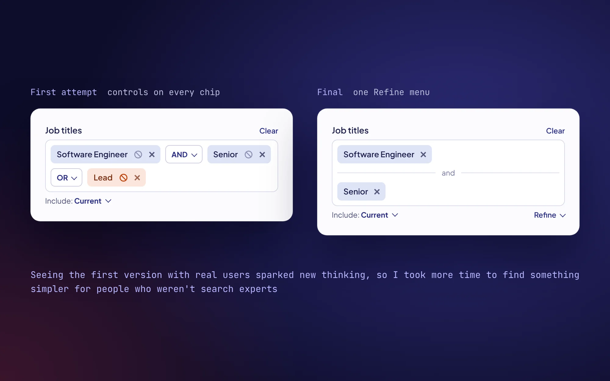
- My first attempt put an exclude symbol on each term and a dropdown between terms to pick AND or OR. Seeing it in practice with real users sparked new thinking, and I took more time to find something simpler for people who weren’t search experts.
- What I chose
- Refine, a single menu beside the field that adds or, and and not as labelled dividers.
- Trade-off
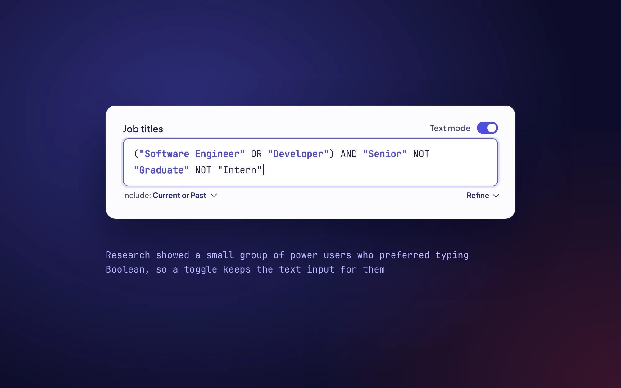
- Research showed a small group of power users who preferred typing Boolean, so I designed a fallback toggle to keep the text input. That meant two input modes to build and maintain.
Decision 4
Moving search into a sidebar
- What I chose
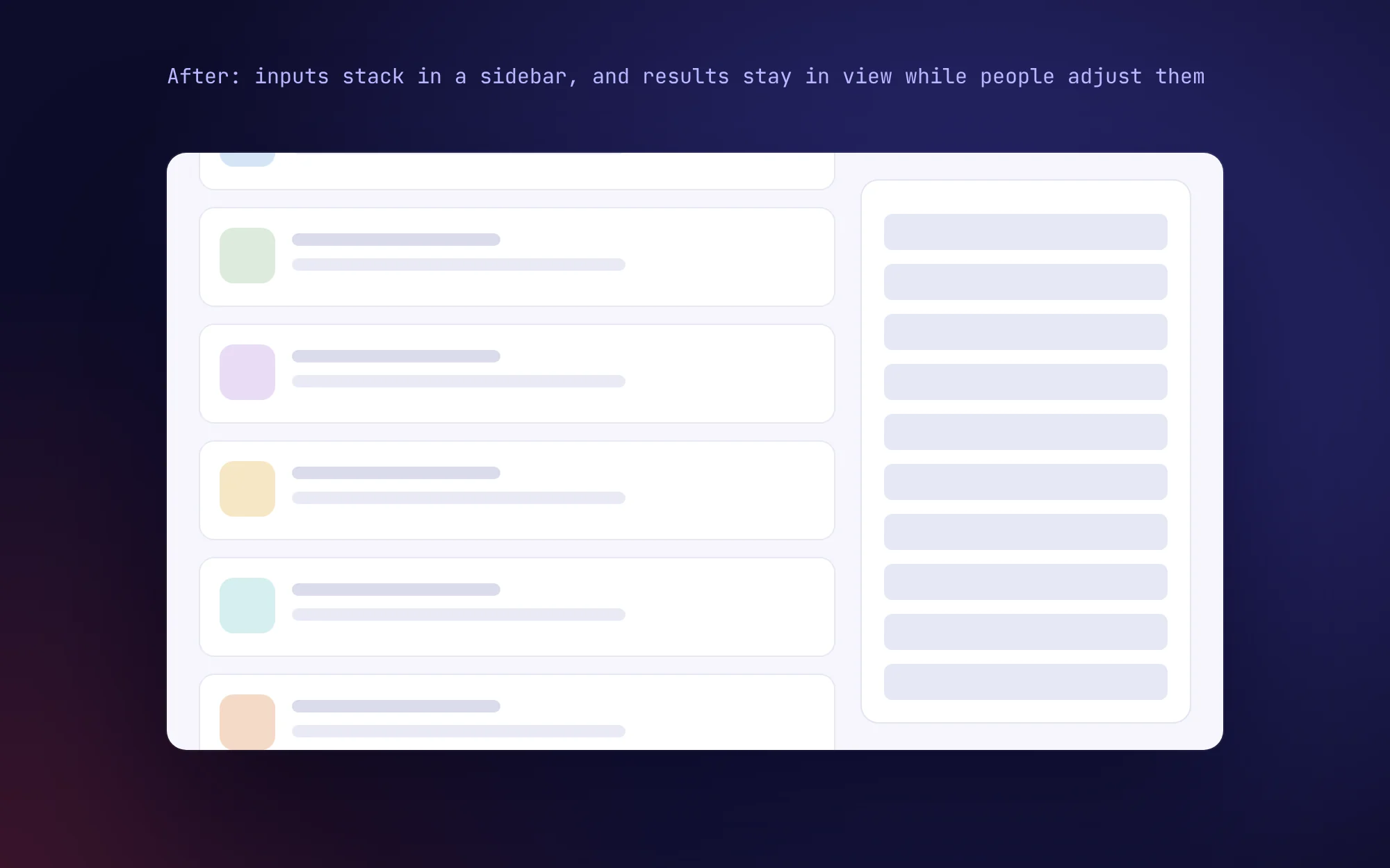
- The side panel.
- Why
- Search had grown to many inputs, and people needed to adjust them while scrolling results. A sidebar gave inputs room to stack and kept results visible the whole time.
Influence
- Stepping into the PM gap. We had a PM for part of the project, and when that role was cut I picked up the product side alongside design. I worked directly with CS and leadership on priorities and owned the release plan end to end.
- Building trust with data science and ML. Tracing the data was also my way in with our data scientists and ML engineers, a connection design hadn’t really had before. The trust I built there meant I could go back to them for clarity and work through solutions together for the rest of the project.
- Leading a squad that was still forming. This was the first time our squad had worked together, and we were very much in forming, storming and norming while trying to ship a major rebuild. None of the engineers had worked with Elasticsearch before, so I pushed for upskilling time to be planned into our sprints.
- Supporting an engineer who was stuck. One engineer was really struggling to get up to speed, and progress had stalled. I tried to be a partner first, supporting his upskilling and research and checking in to understand where the roadblock really was. Was it learning, focus or motivation? It came down to confidence. He was worried about exposing gaps in his skills, so he held back instead of asking for help.
- Bringing the company along with the release. I ran a short beta with a few customers and adjusted interactions before full release, ran walkthrough sessions for CS and marketing, made GIFs, video walkthroughs and Looms, wrote the marketing copy, updated product documentation and set up FullStory dashboards to track outcomes from day one.
- What outlasted the project. Product documentation of how search worked, where there had been none. FullStory dashboards for tracking search after release, and stronger working relationships between design, data science and ML. Follow-on sprints used the deferred items from discovery as the starting backlog.
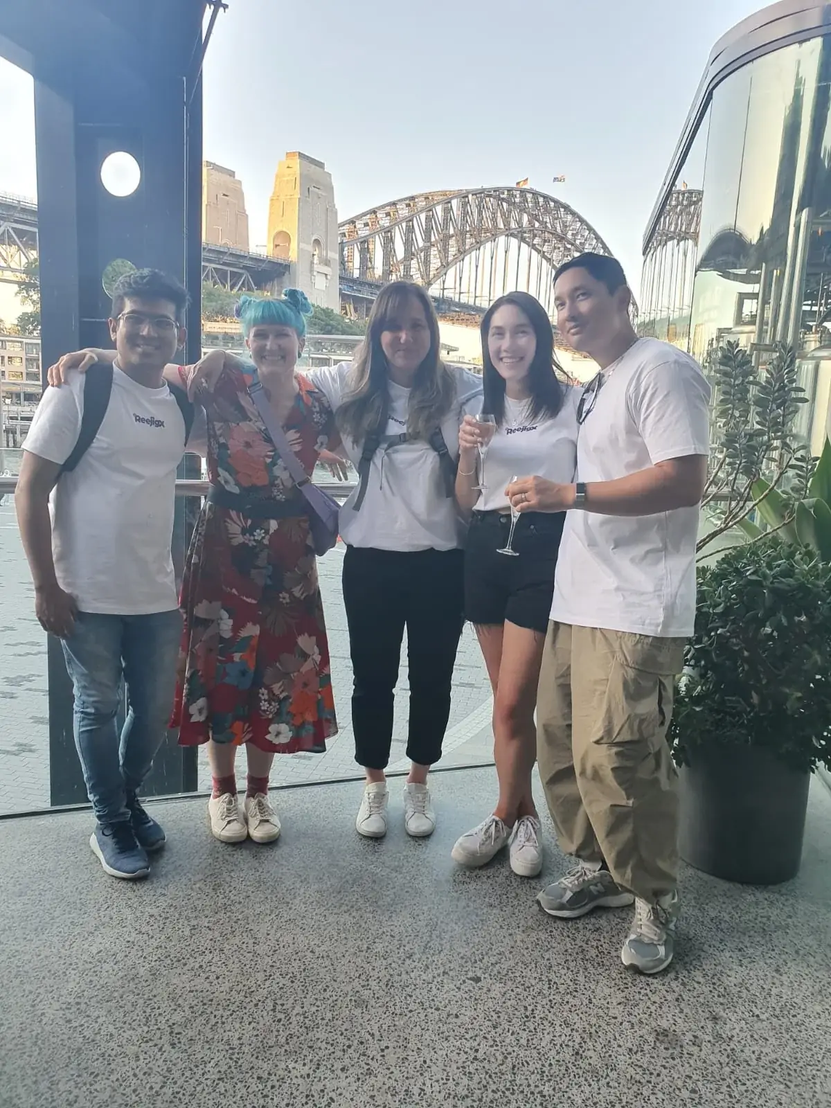
Jess is highly skilled at working with and leading cross-functional teams, including developers, product managers, customer success managers and other designers.
 Mim StebbingHead of Product Design, Reejig
Solution
The final experience rebuilt the search component and the flows around it, used one consistent pattern across four areas of the product, and kept the interface simple even though there’s a lot of capability underneath.
- Refine. Boolean logic without writing any syntax. Refine adds or, and and not as labelled dividers, so the logic reads at a glance.

- A fallback for power users. Text mode keeps typed Boolean for the people who wanted it.
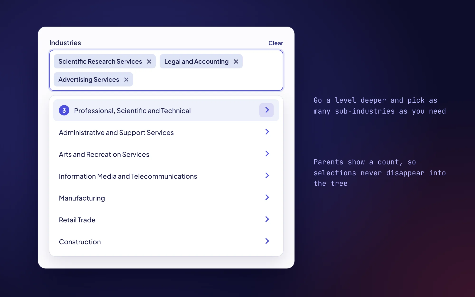
- Multi-level, multi-select filters. People can go a level deeper and pick as many sub-industries as they need, and parents show a count so selections never disappear into the tree.
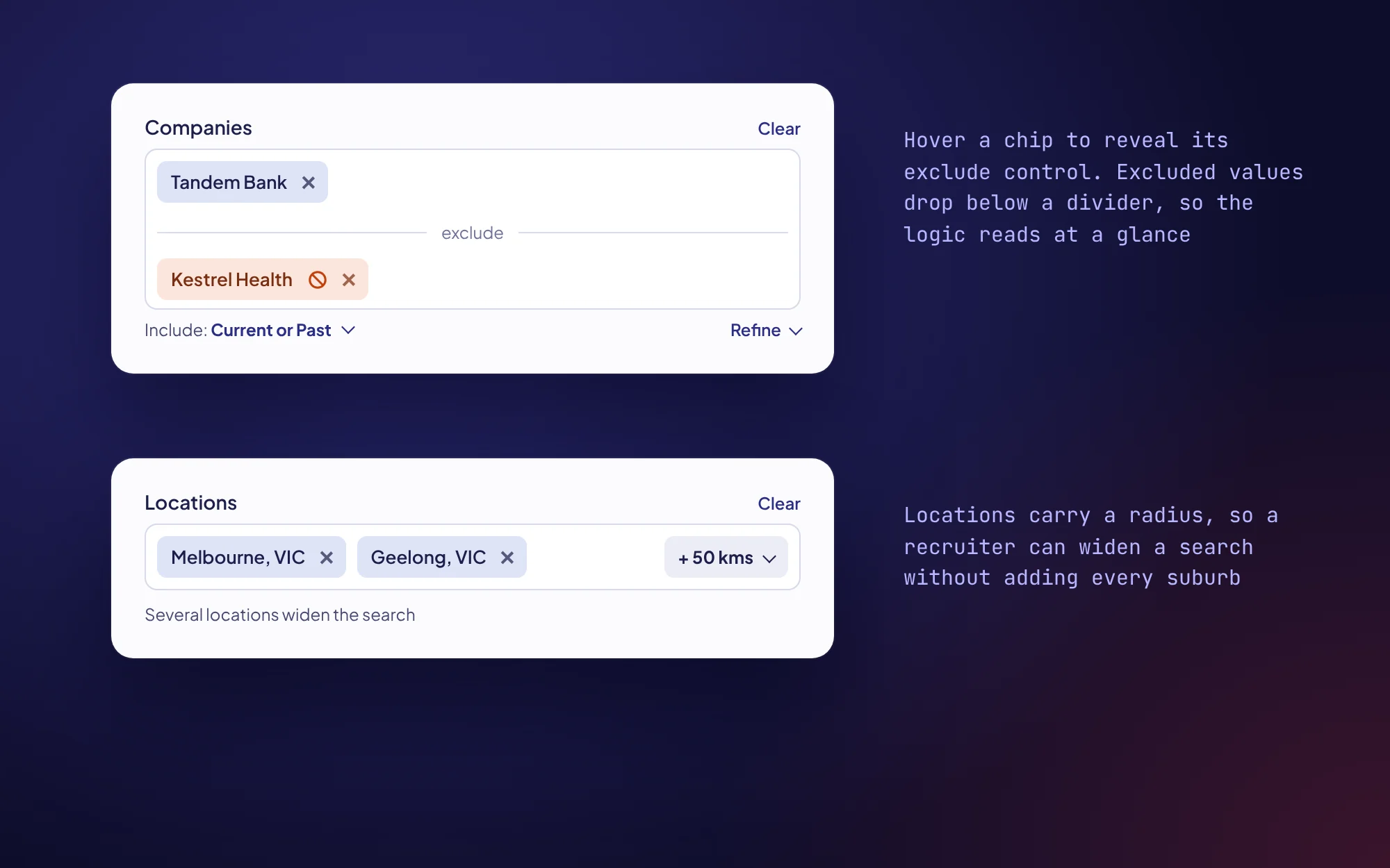
- Exclude and location radius. Hovering a chip reveals its exclude control, and locations carry a radius so a recruiter can widen a search without adding every suburb.
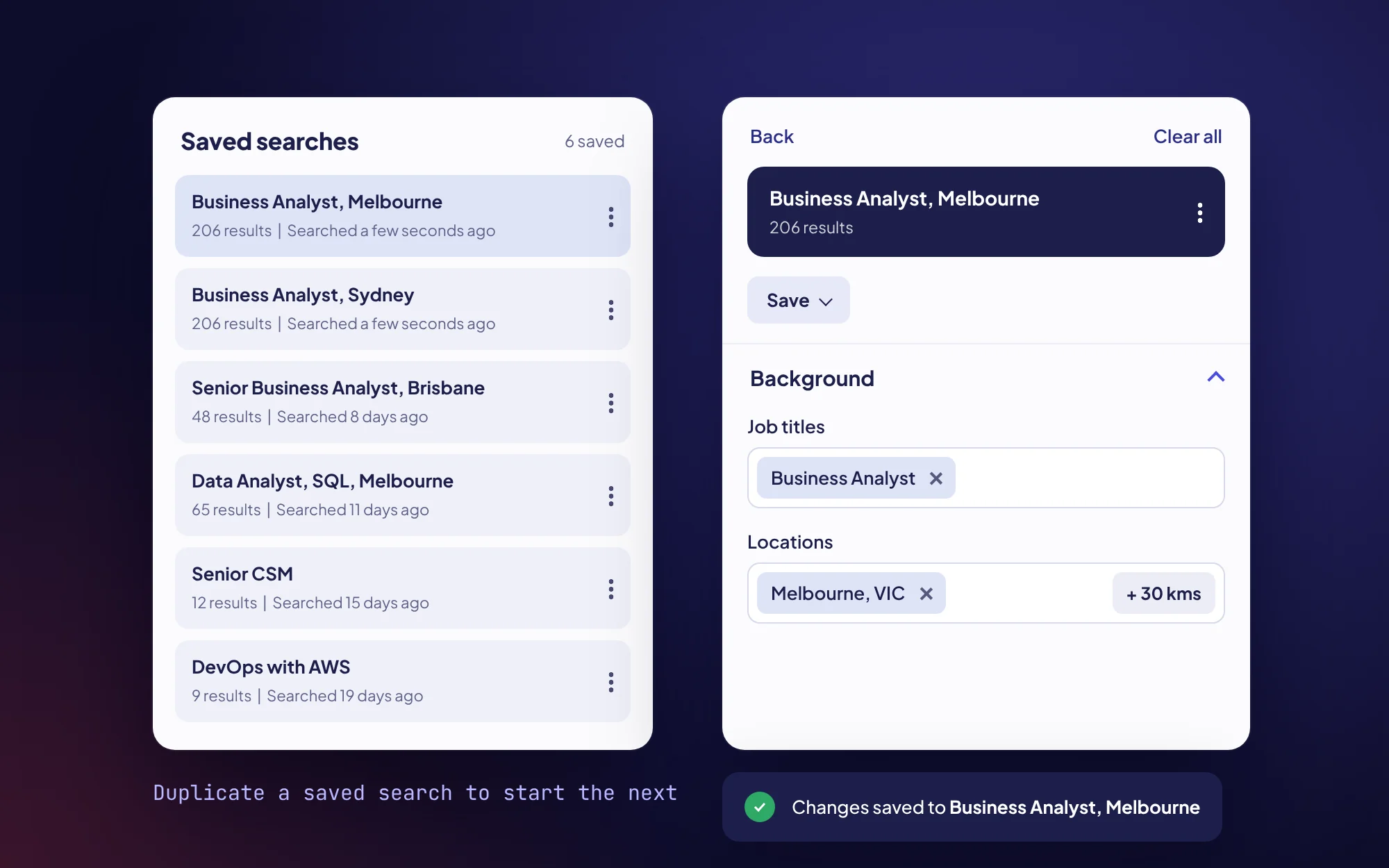
- Saved searches. I redesigned saved searches so recruiters could come back to a complex search without rebuilding it, with names, result counts and a menu to duplicate, share or turn a search into a community.
Outcomes
After release, more people used Ecosystem, they spent more time in it, and they quickly took up the new tools.
- ~200%Increase in the proportion of users active in Ecosystem, compared with the quarter before release
- ~300%Increase in active time on page in Ecosystem, compared with the quarter before release
- 50Sessions using Refine in the first 7 days
- 173Saved searches in the first 7 days
More time on page can also be a sign that people are struggling, so I checked it against FullStory session recordings. They showed people running, refining and saving searches, and not getting stuck the way they had before.
Reflection
I’m most proud of how visually simple the final search is, given how much capability sits underneath it. Getting there meant uncovering a lot of unknowns first, and that time spent tracing the data paid off in every decision after it.
- Set baselines before release. I set up the FullStory dashboards alongside the release, so the 7-day adoption numbers had nothing to compare against. Next time I’d instrument the old experience first.
- Build team foundations from day one. Our squad spent real time forming while also trying to ship. I’d set up ways of working, crits and clear expectations right at the start, which is what I went on to do at TeamHiiv.
- Address performance concerns earlier. I assumed the squad would be comfortable being open about what they didn’t know, but people from different cultures and backgrounds have really different expectations around that. Next time I’d make it safe to say “I don’t know” from the start and raise concerns sooner.
Product screens are rebuilt in code with sample data. All people and companies shown are fictional.