Better business plans at EngineRoom
I turned a 32-page planning feature only our managing director could navigate into a guided plan advisors used with almost every customer.

Snapshot
Drove active plan adoption from 6% to 83% of the customer base by September 2021.
- Role
- Senior Product Designer and Project Lead
- Company
- EngineRoom, a roughly 25-person digital growth advisory with an in-house platform for its SME customers
- Team
- 1 designer (me), 1 tech lead, 1 software engineer and 1 data scientist. The managing director and 3 advisors were core stakeholders.
- Timeline
- March 2020 to July 2021, in two phases (8 months, then 3 months)
Where we started
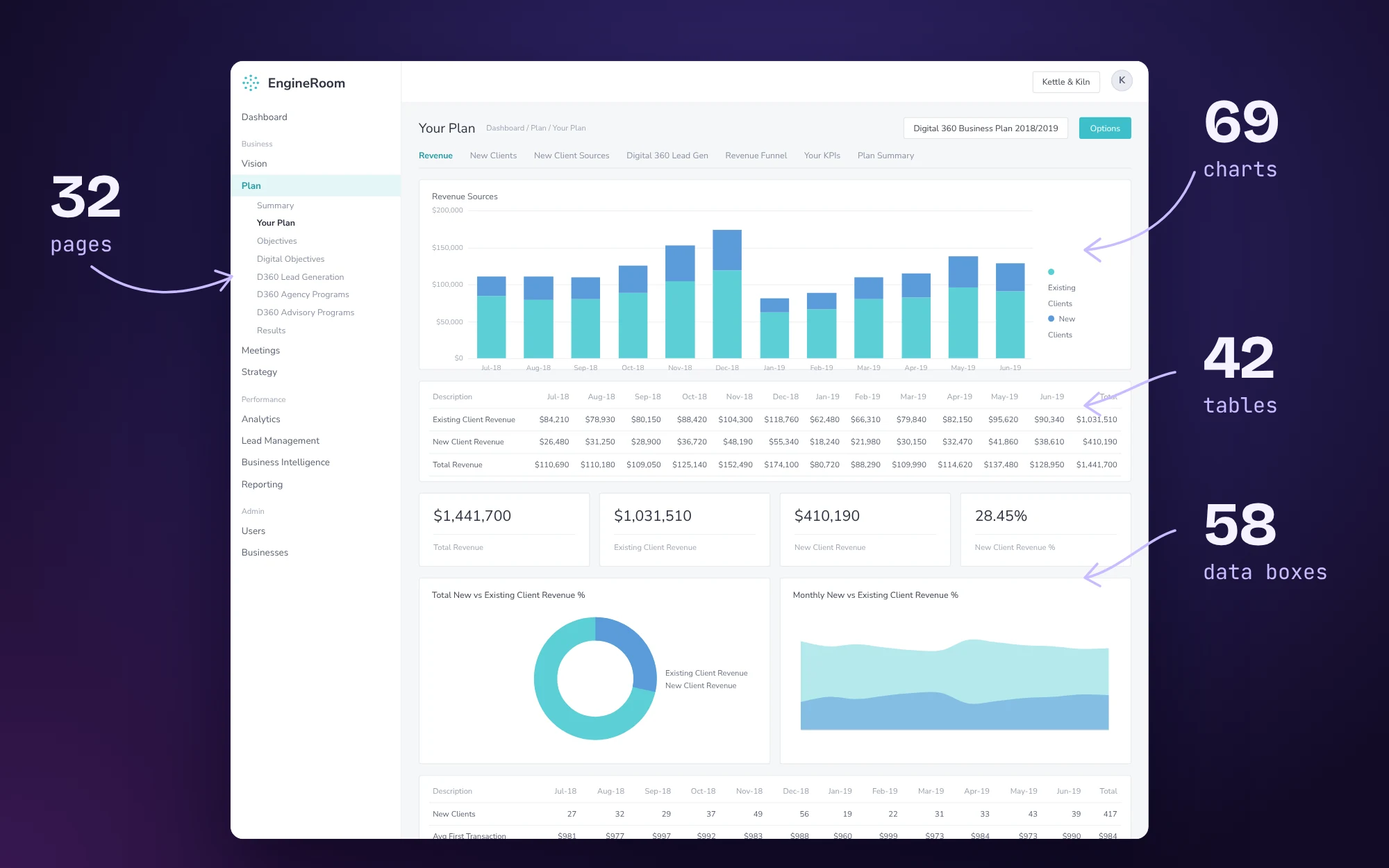

Context and the real problem
Plan was understood by our managing director. It needed to be used by advisors.
The stakes
- Plan was meant to be EngineRoom’s proof of value: the place that connected a customer’s revenue growth to the marketing work we delivered for them.
- In practice, only 3 customers had an active plan, two of which were built by hand in Excel.
- That undercut something EngineRoom actively sold.
The brief
- “Make plans easy.”
- Targets: 100% of customers with a completed plan, a 50% lift in weekly active users in Plans, and 80% advisor satisfaction.
How I reframed it
- Our managing director’s judgement lived only in his head: what a good plan looks like, and how revenue breaks down into customers, leads and spend. The clunky interface grew out of that.
- I won’t design for data I don’t understand. So I spent time with him unpacking how he read a business: which figures he looked at, in what order, and how he got from raw numbers to a decision.
- That shifted the focus to making his reasoning visible on screen, so an advisor could follow it, trust it and explain it to a customer.
Key decisions
Decision 1
Show the work, not just the answer
- What I chose
- Every derived figure shows its formula inline. Revenue × % of customers from EngineRoom ÷ average transaction yield gives new customers needed; ÷ conversion rate gives leads needed.
- Why
- That chain was our managing director’s mental model, pulled out of him over many sessions. Advisors defaulted to other analytics or had to get time with him to create something for a customer.
- Trade-off
- More on screen in an already dense feature. I kept the formulas in dismissible tips (“Hide these tips”) so experienced advisors could clear them.

Decision 2
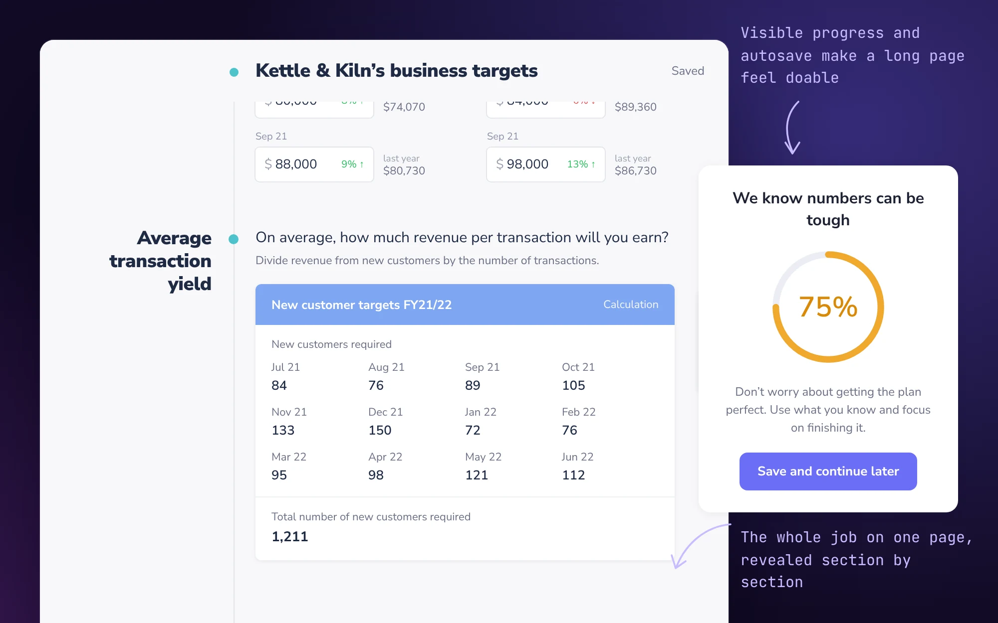
One flowing page instead of a wizard
- What I chose
- One page that shows every input up front and reveals sections progressively, with a progress ring and “save and continue later”.
- Why
- A wizard makes the user do the navigating. A single page moves that weight onto the system, so people see the whole job and feel guided rather than processed.
- Trade-off
- A long page can look daunting. I offset it with reassuring copy (“Don’t worry about getting all the details”), visible progress and progressive reveal.
Decision 3
Don’t force everything through Xero
- Constraint
- Xero was meant to be the data backbone. But businesses set up their accounts in bespoke ways, API data arrived inconsistently, and some setups had no clean mapping.
- What I chose
- Multiple entry routes: Xero, results input, CSV import and manual entry.
- Trade-off
- Manual data is less reliable. I compensated at the point of entry with year-on-year % growth beside every monthly figure, and a warning when monthly targets didn’t add up to the total.

Decision 4
The pivot, from a customer’s tool to an advisor’s tool
- Hypothesis disproven
- Customers would fill in their own plans. Phase 1 completion stalled at 25% through the Victorian lockdowns, when owners had no headspace for planning.
- What I did
- On the beta calls I shadowed, advisors ran Plan live with customers. Once it was usable, it gave them confidence and became something they wanted to show.
- What I chose
- In phase 2, less dependence on customer input, a choice of plan type (full business plan or marketing projections only), and advisors building plans with or for customers.
- Trade-off
- Customers had less hands-on ownership of their plan. In return, plans got done, and planning became part of the advisory relationship rather than homework.
- Result
- This wasn’t one person’s call. It emerged from what the beta showed us, and I designed phase 2 around it.
Influence
- Alignment through our managing director’s own logic. I kept him on board by showing how his reasoning came through as a tool, freeing him up to do other work. When the targets flow broke a business down the way he would, he was on board.
- Testing in the field, not in a room. I trained advisors first, then shadowed their live calls with 9 beta customers across revenue plans with Xero or MYOB, ecommerce, customer and leads plans, and different levels of technical comfort. What I saw on those calls shaped phase 2.
- Stretch goals with engineering. I worked closely with our software engineer and data scientist and kept setting the bar just beyond what felt possible. When Xero data couldn’t support it, we agreed on alternative entry routes rather than stalling.
- What outlasted the project. I documented the visual rules from Plan as EngineRoom’s Data Display Strategy: colour for data type, pattern for planned versus actual, card hierarchy for summary versus depth. Plan also became the foundation for Annual Strategy reporting.
Solution
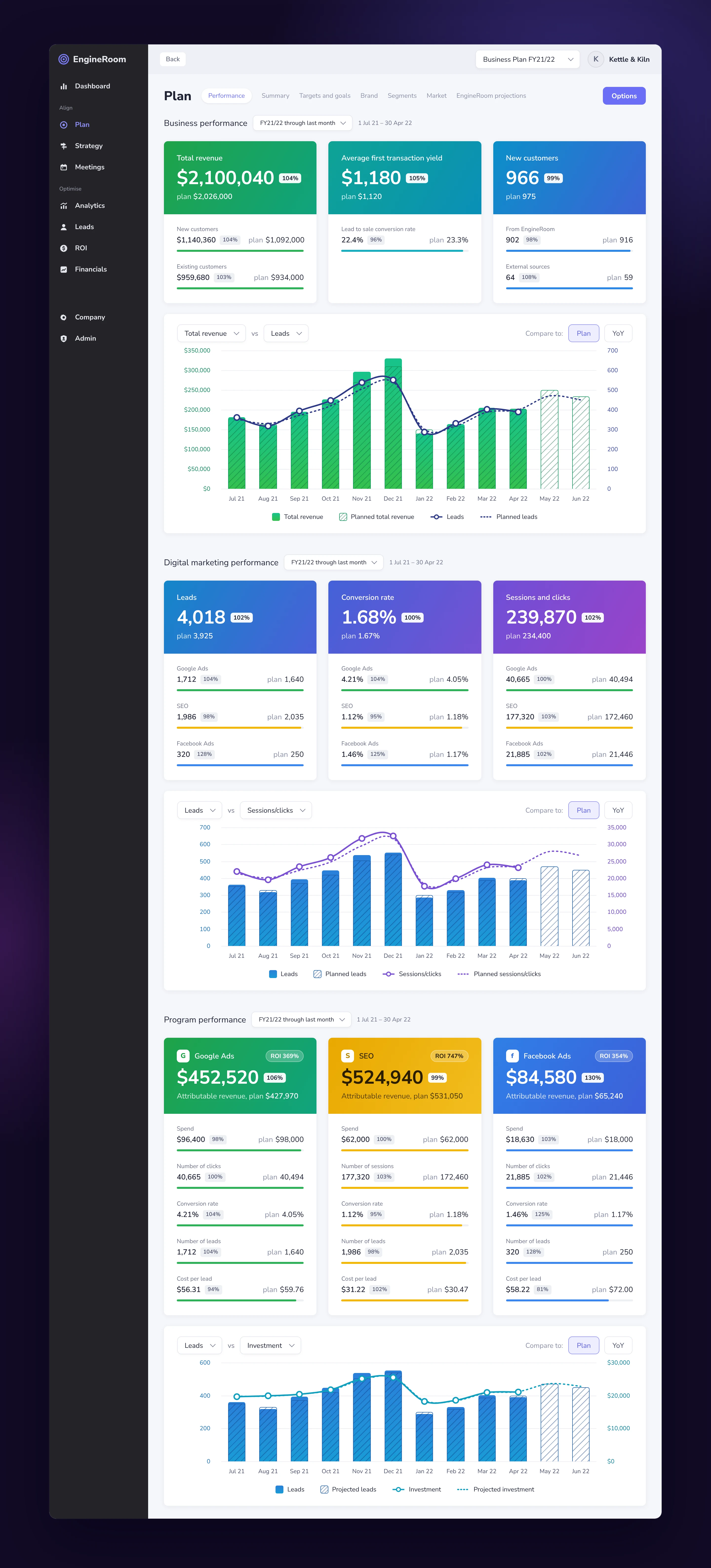
- Data cards with drill-down. Each card leads with one figure, its plan and % to plan, such as $2,100,040 against $2,026,000. Underneath, it breaks into the parts that build it, so an advisor can see why a customer is off track.
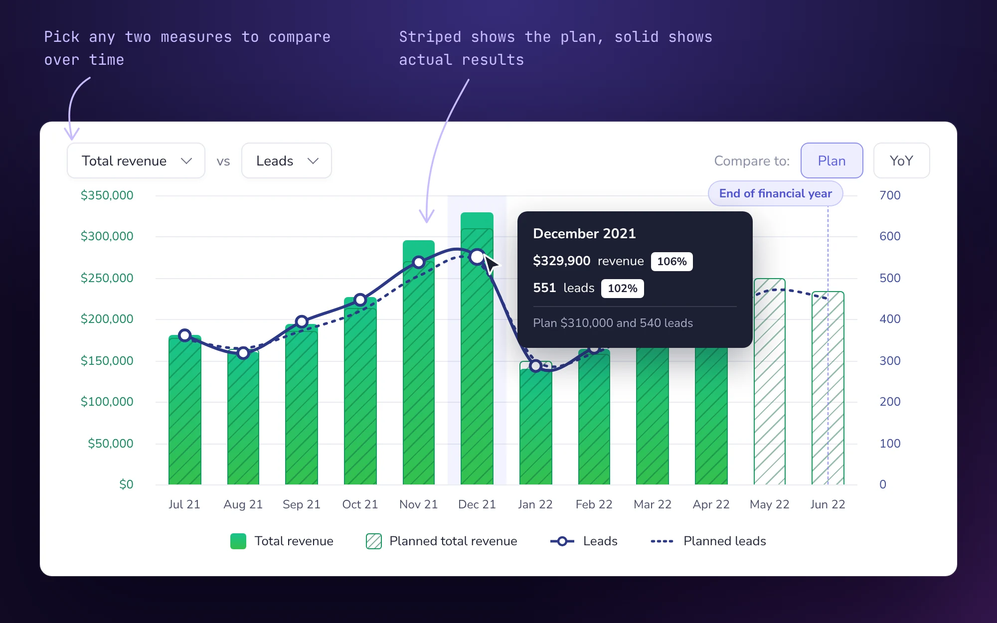
- Solid for actual, striped for planned. Pattern carries the meaning as well as colour, so planned versus actual reads at a glance and doesn’t rely on colour alone.
- “Choosy charts”. Two pickers let you compare any two measures over time, such as total revenue against leads, which is how EngineRoom showed its marketing was hitting its own targets.
- Key dates on the chart. Moments like end of financial year sit on the timeline, so a dip or spike has context.
- Plan type first. Choosing between a full business plan and projections only means the form asks just for what that plan needs.
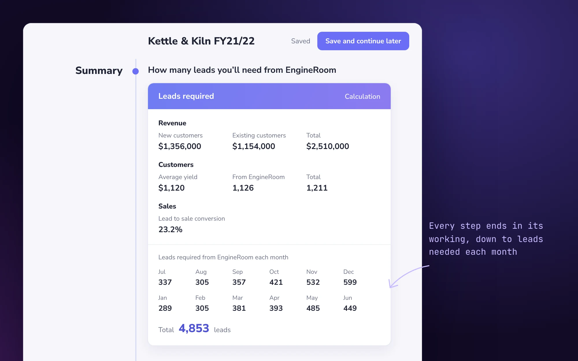
- Every calculation shown. Each step ends in a summary card with its working, finishing at leads required per month.
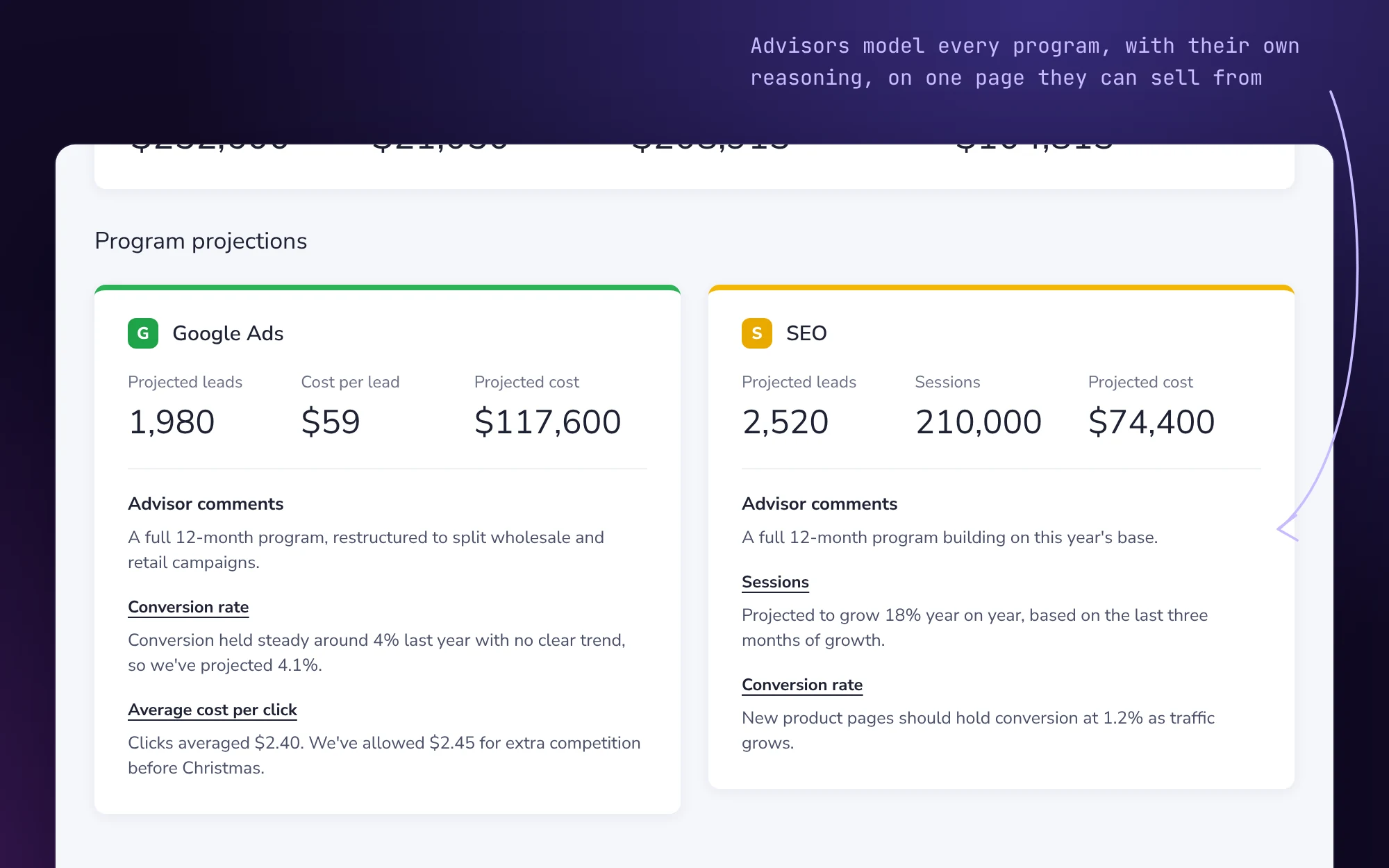
- Projections to sell from. Advisors model the leads, cost and revenue of each program, with their own commentary, on one page they can use in a conversation about investing more.
Outcomes
Planning went from something 3 customers did to something nearly every customer had.
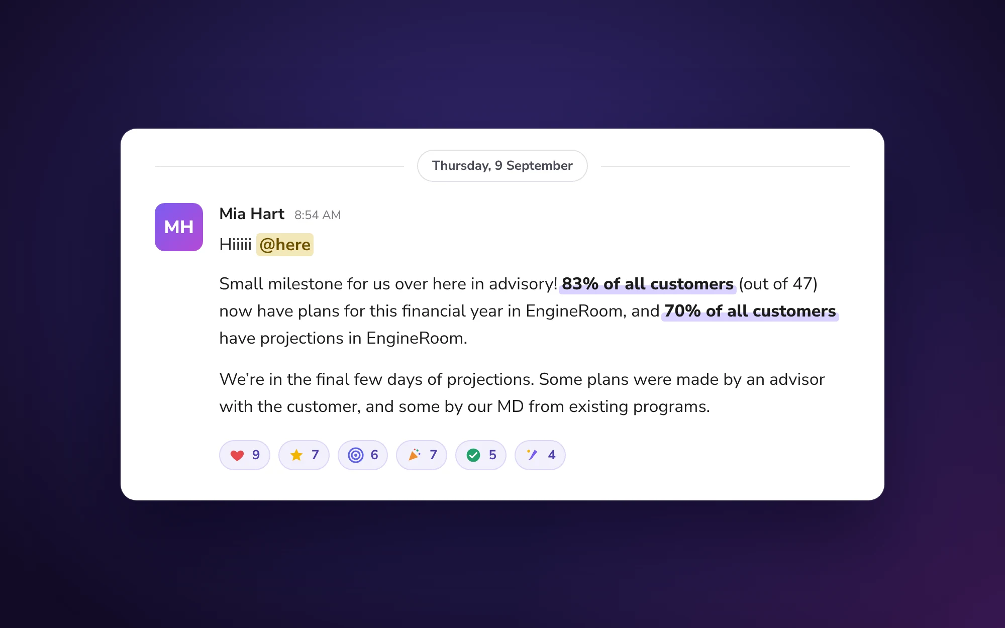
- 39 of 47Customers with a plan for the financial year (83%) by September 2021, up from 3 of about 50
- 70%Customers with projections entered, by September 2021
- 8 of 9Beta customers who completed a plan
- 100%Advisor satisfaction, against an 80% target
Reflection
- Making existing depth usable is its own skill. Plan wasn’t a blank canvas. My job was to make our managing director’s expertise legible to everyone else, and the most effective move was literally showing the working.
- Test who the user really is. We designed phase 1 for customers filling in plans themselves. Watching advisors on live calls told us the real user was the advisor-and-customer pair. I’d get into those calls months earlier next time.
- Know the difference between “this didn’t work” and “this hasn’t had its moment”. Phase 1’s 25% was partly timing. The second run worked because we also changed who did the planning.
Product screens are rebuilt in code with sample data for a fictional business. The team message is recreated, with names changed.
Next case study
Read case study