
Case Study Presentation
Talent Search and Filter — Reejig
Improving the talent search and filter experience in Reejig
Reejig is a workforce intelligence platform that uses data aggregation, ML and Ethical AI to build talent profiles, predict attrition and match folks to work opportunities.
We understood there were big problems with search — a simple UX review alongside numerous support requests established the problem space.
My Framework
I followed my design process, enabling us to diverge and converge strategically.
I value being flexible and adaptable in ways of working. To first understand the current state of the team, product, environment, customer, goals, needs, etc and to mindfully structure approach based on where we’re at.
Kicking off this piece of work, we had no existing customer interviews, competitor research or product analytics to reference, so I planned a more comprehensive discovery phase to ensure we took a wide enough dive to truly empathise with customers and understand the problem space.
Our squad had never worked together and none of the engineers were familiar with ElasticSearch, so we’d need time to harmonise and upskill
Collaboration with data and engineering is incredibly important to how I work — ensuring the team is given space to participate in research, brainstorming, solving problems, co-creating
When possible, bias towards action and experimentation — understanding risk vs value and how we can best experiment (idea generation, wireframes, prototypes, beta launch, code demos)
The Problem
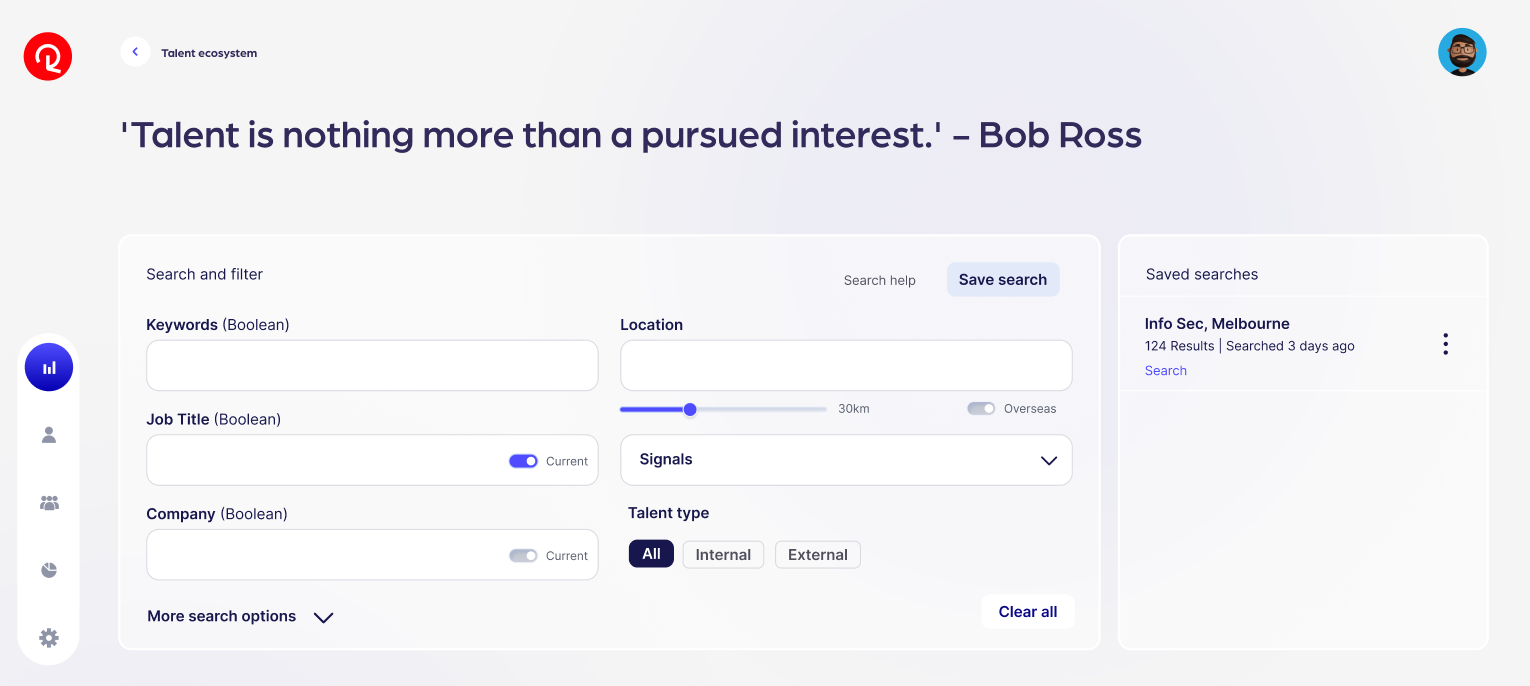
The existing solution in product
The existing search wasn’t backed by research, strategy or much technical understanding. There was no documentation to understand how it worked.
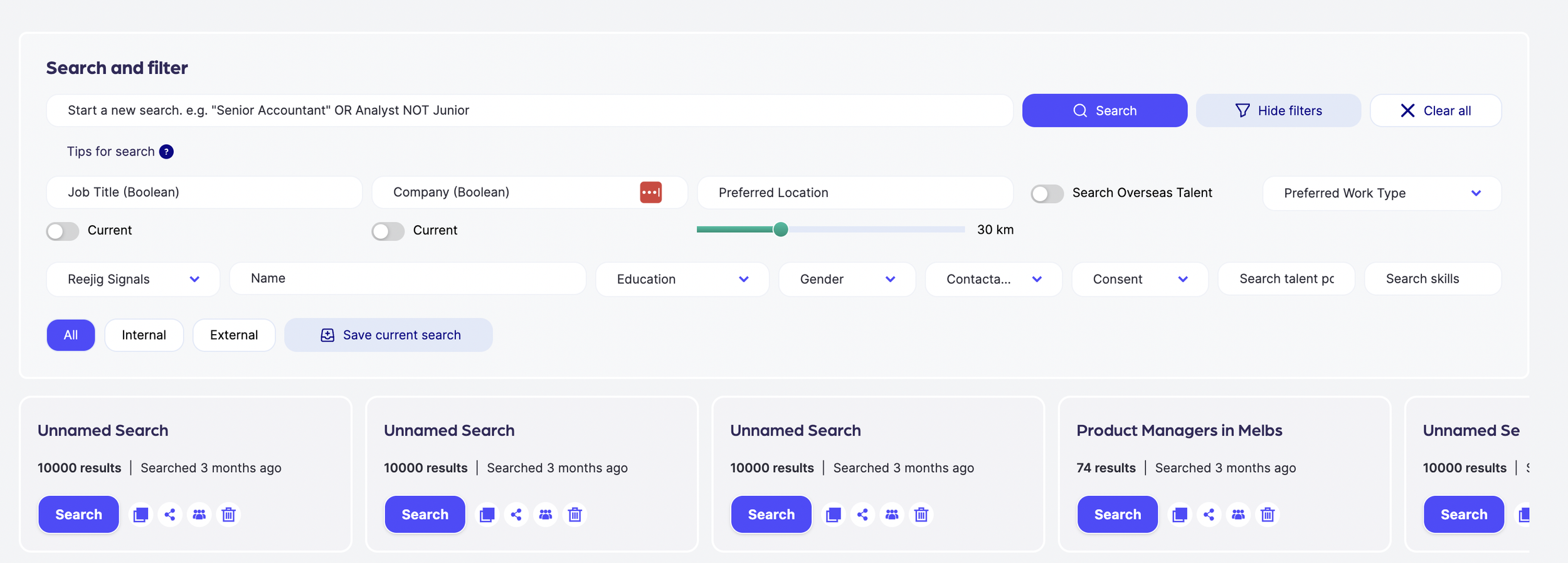
“Also the fact that I have to type in San Francisco into Reejig drives me nuts. I didn't even know there was another one and that's like the worst word to type.” — User in response to location search
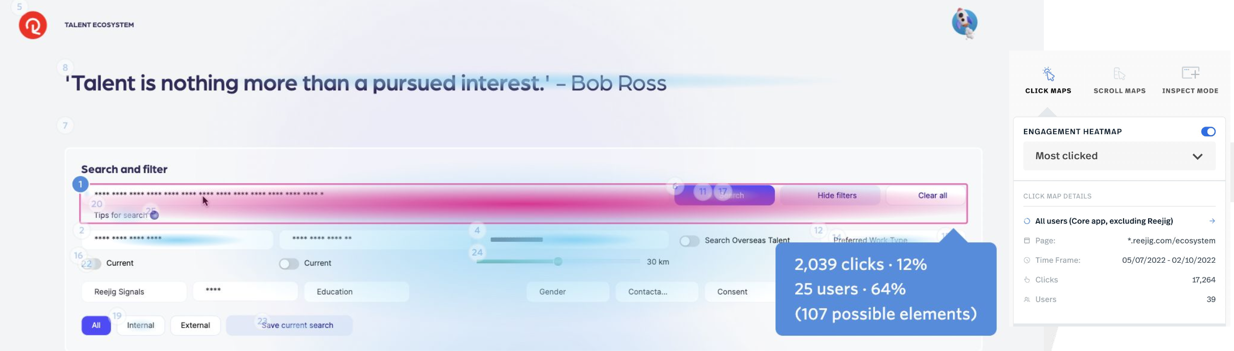
Gathering initial insight from tools like Fullstory and direct customer feedback.
Building an initial understanding of friction and frustration
I value data-driven decision making
I gathered existing tickets and customer feedback from CSMs
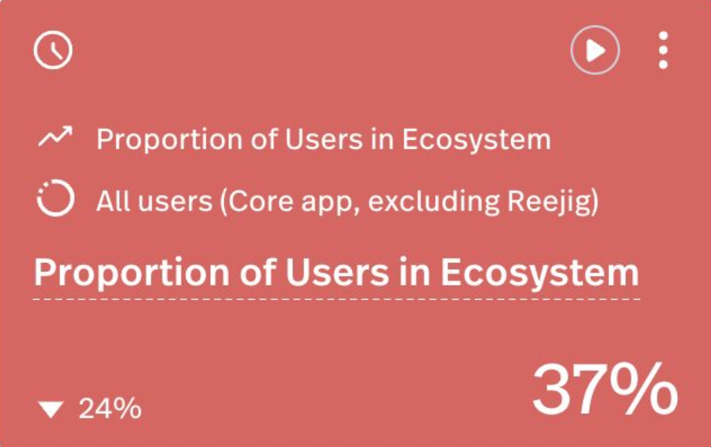
Setup dashboards and heatmaps in Fullstory (product analytics)
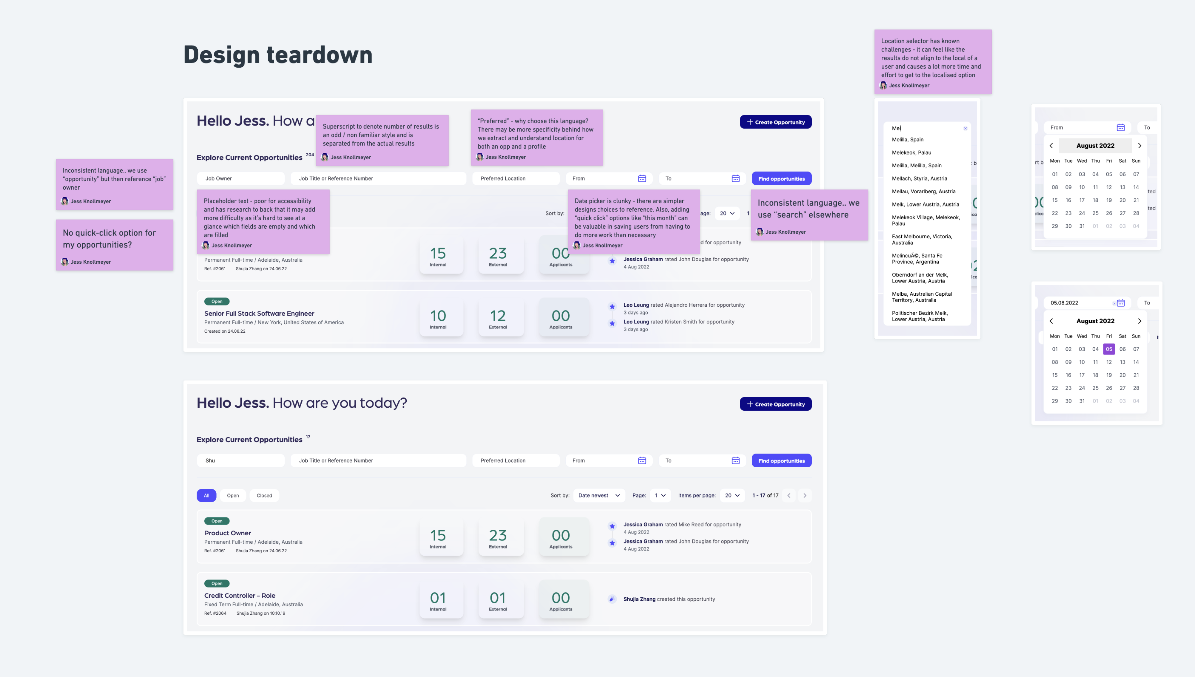
Completed an initial UX review/teardown
The initial qual and quant data was indicative of the size of the problem.. the depth and scale of issues was across the entire feature and experience.
Research & Discovery
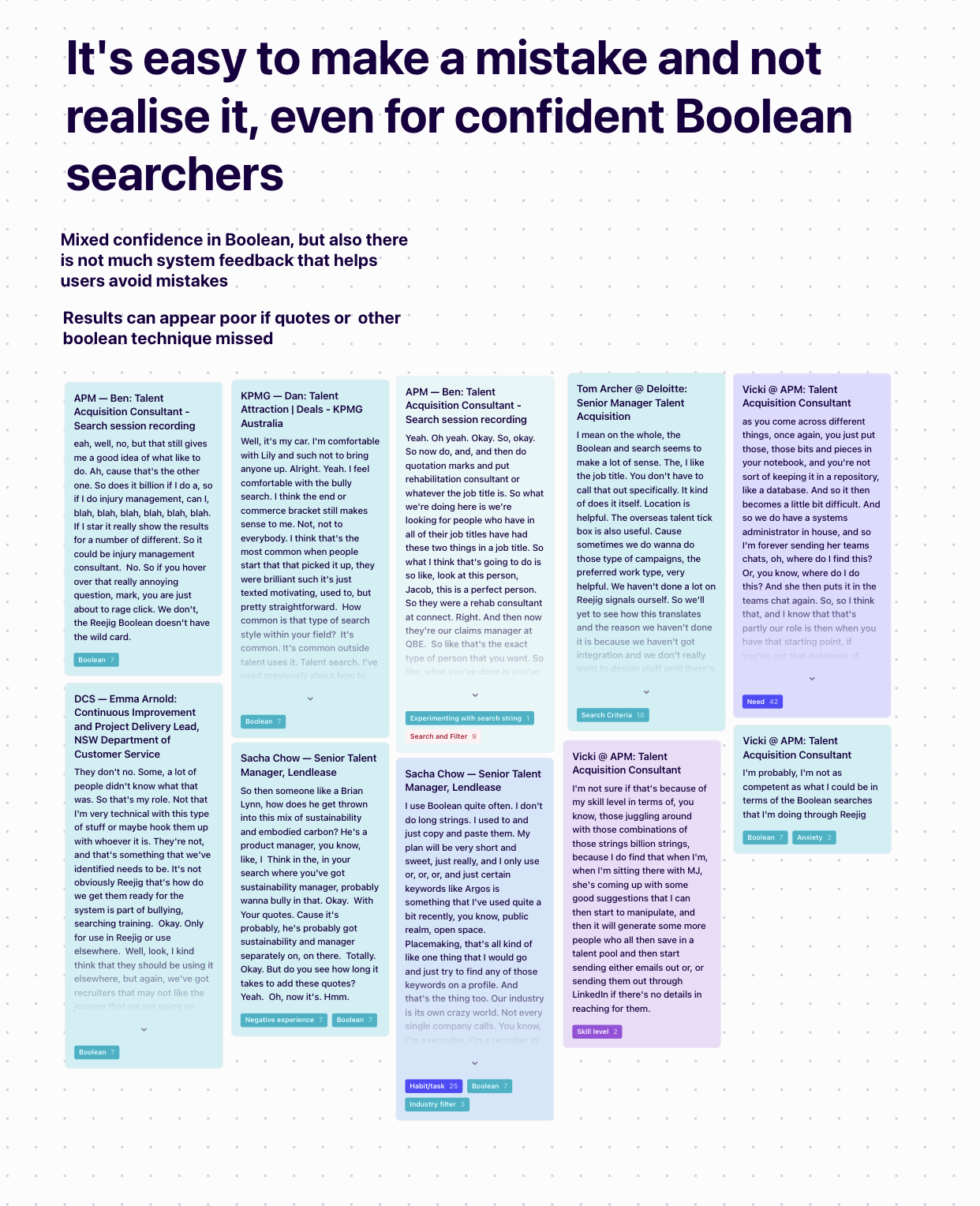
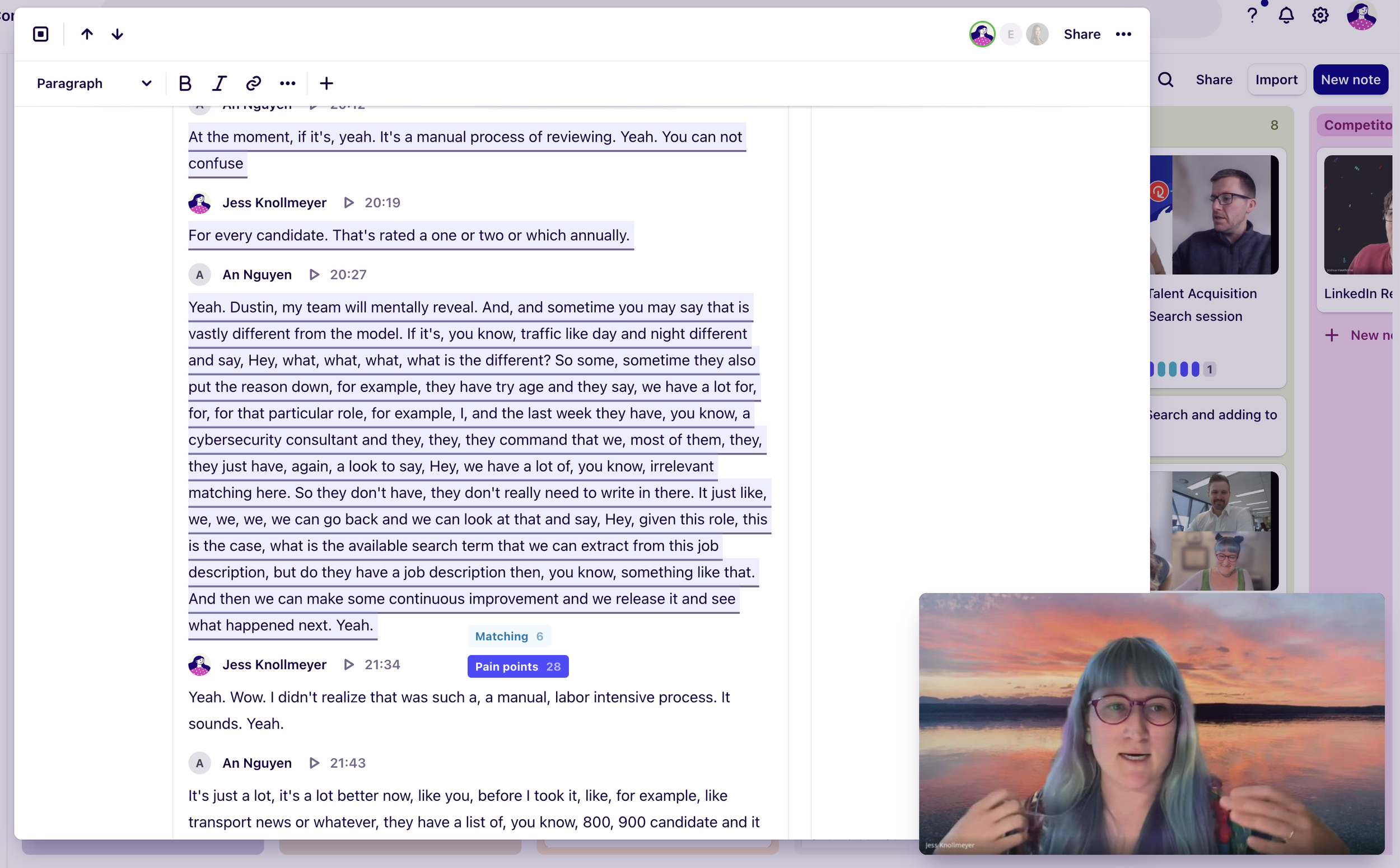
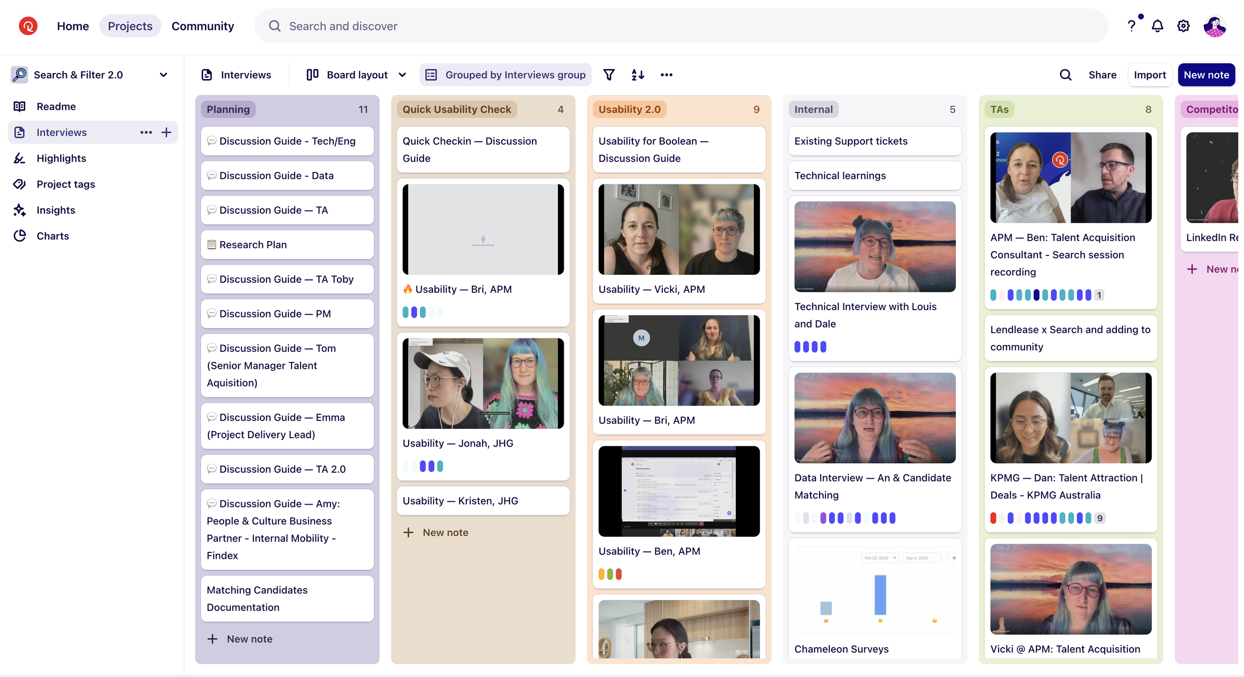
Internal and user interviews, synthesis and learnings
Building a research plan
Designed a generative research plan that included user interviews, session recordings, product analytics and competitor analysis
I interviewed 6 primary audience and 2 secondary
My secondary research came through internal interviews with our engineers, data teams and recruiters
Why? I needed to understand more in-depth about our users, their needs, workflow, habits, etc as well as the current state of our product and tech.
A small sample of process in Whimsical
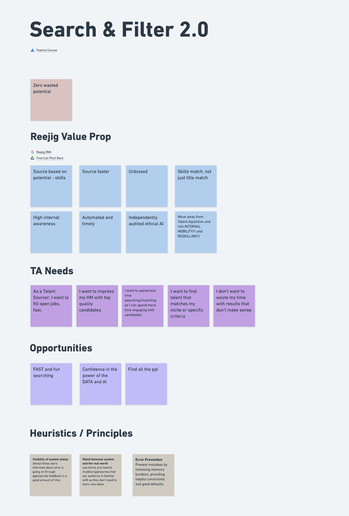
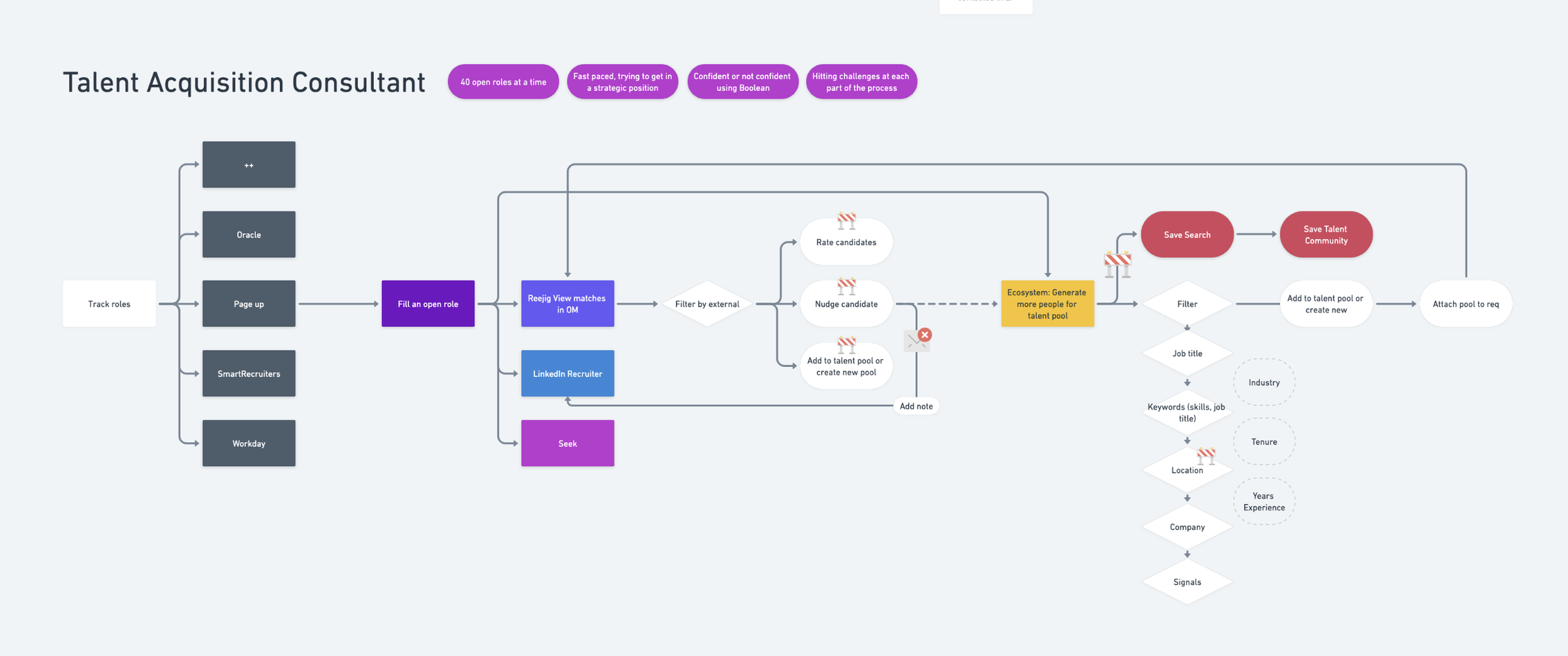
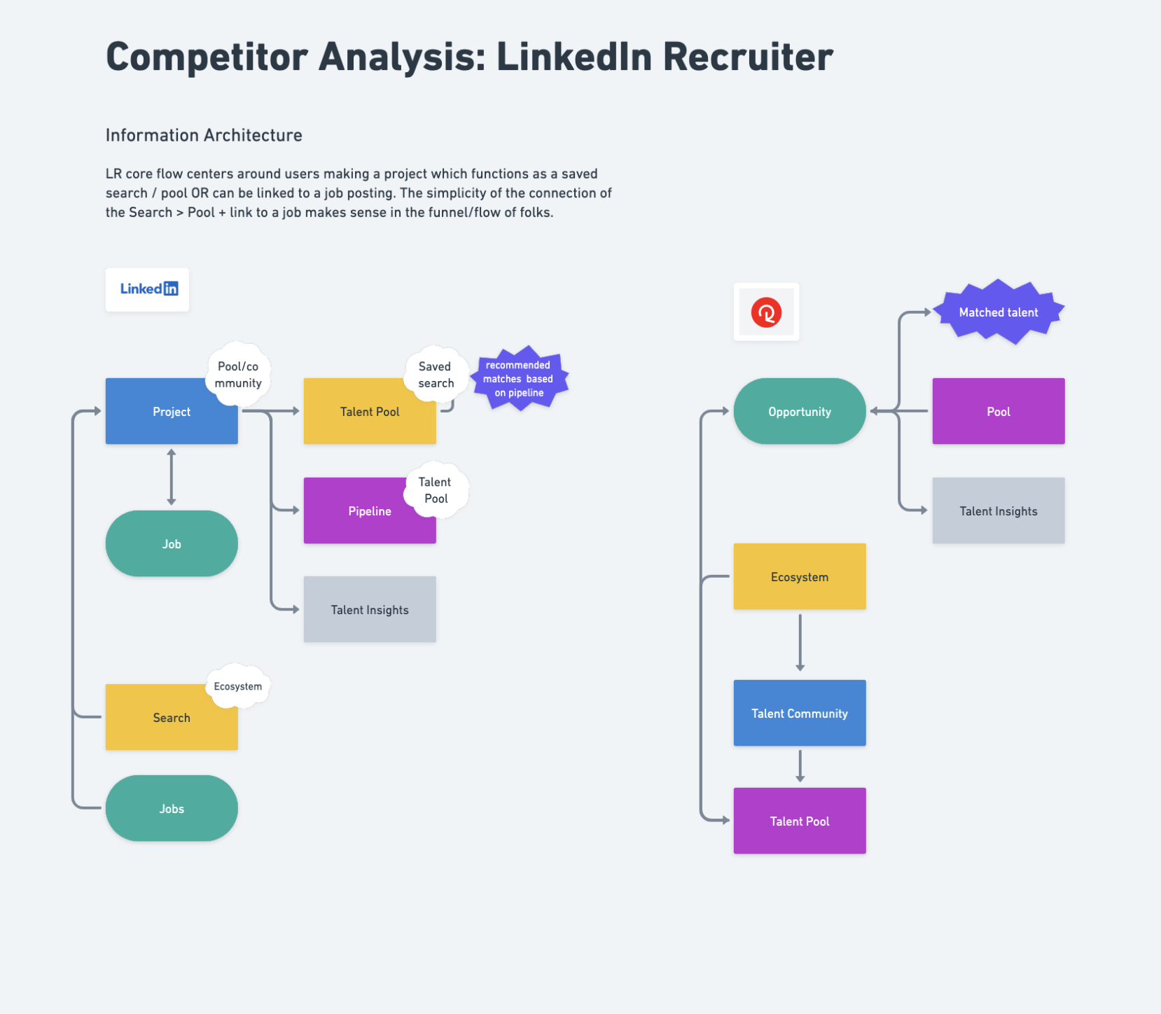
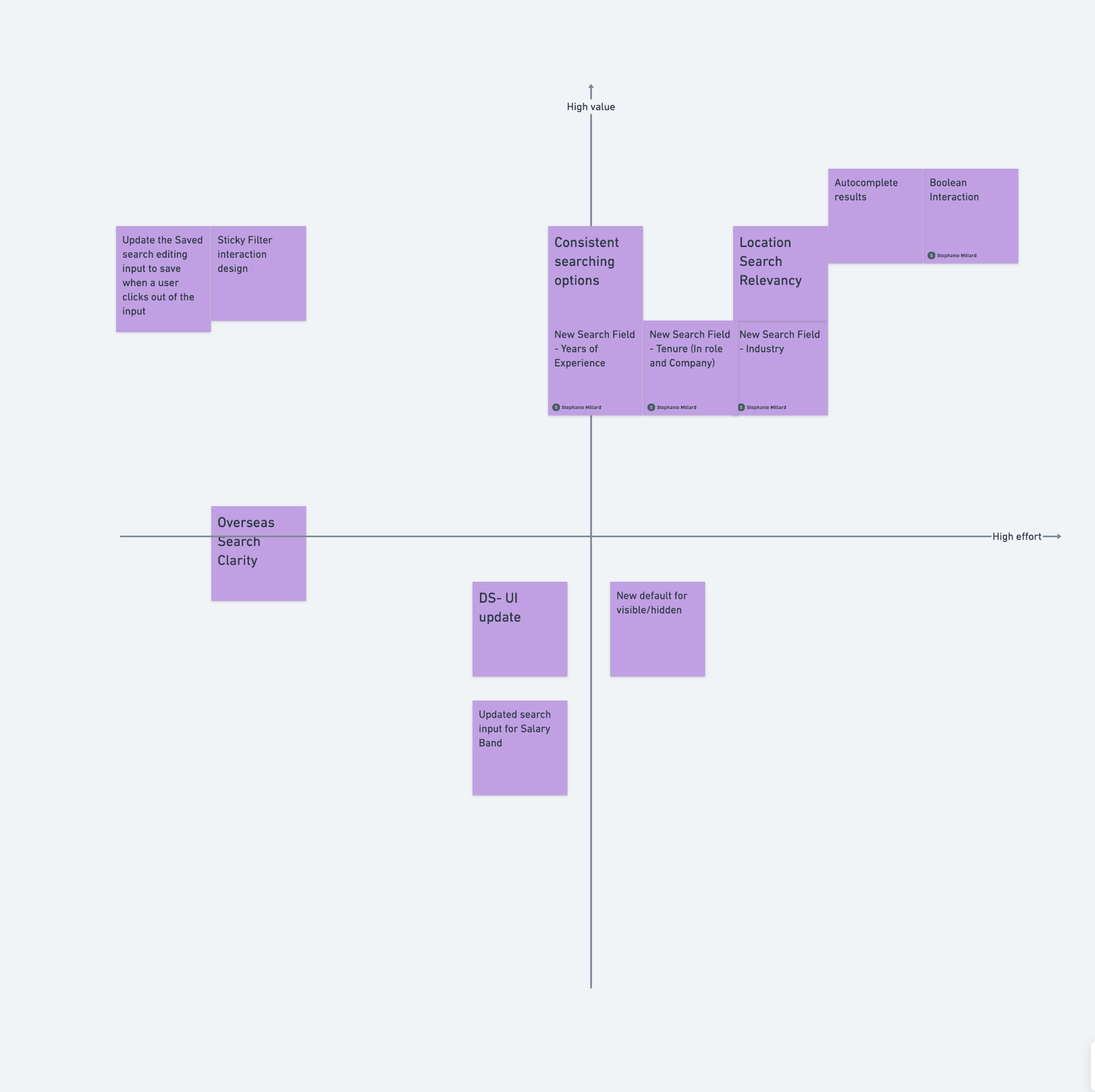
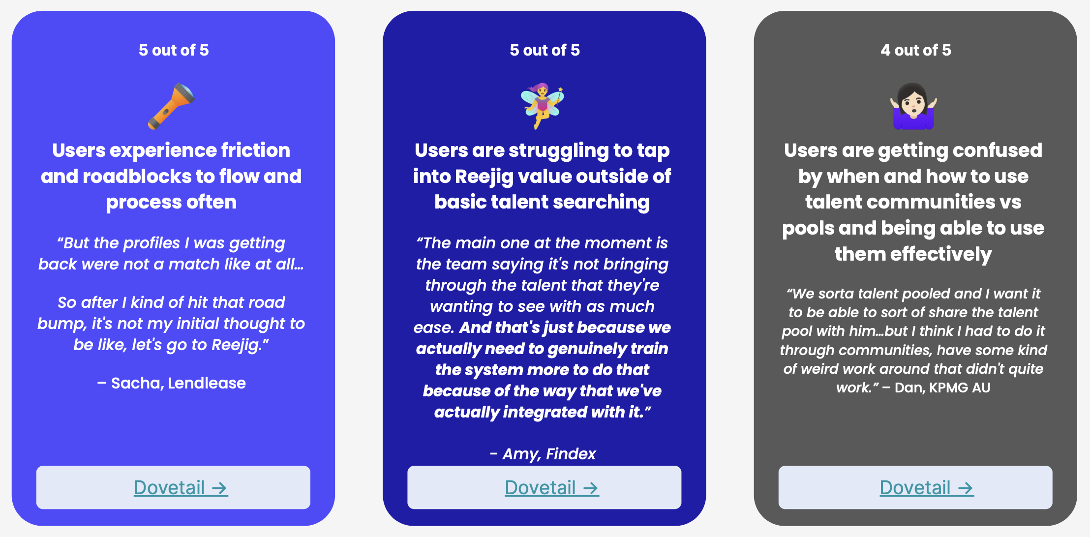
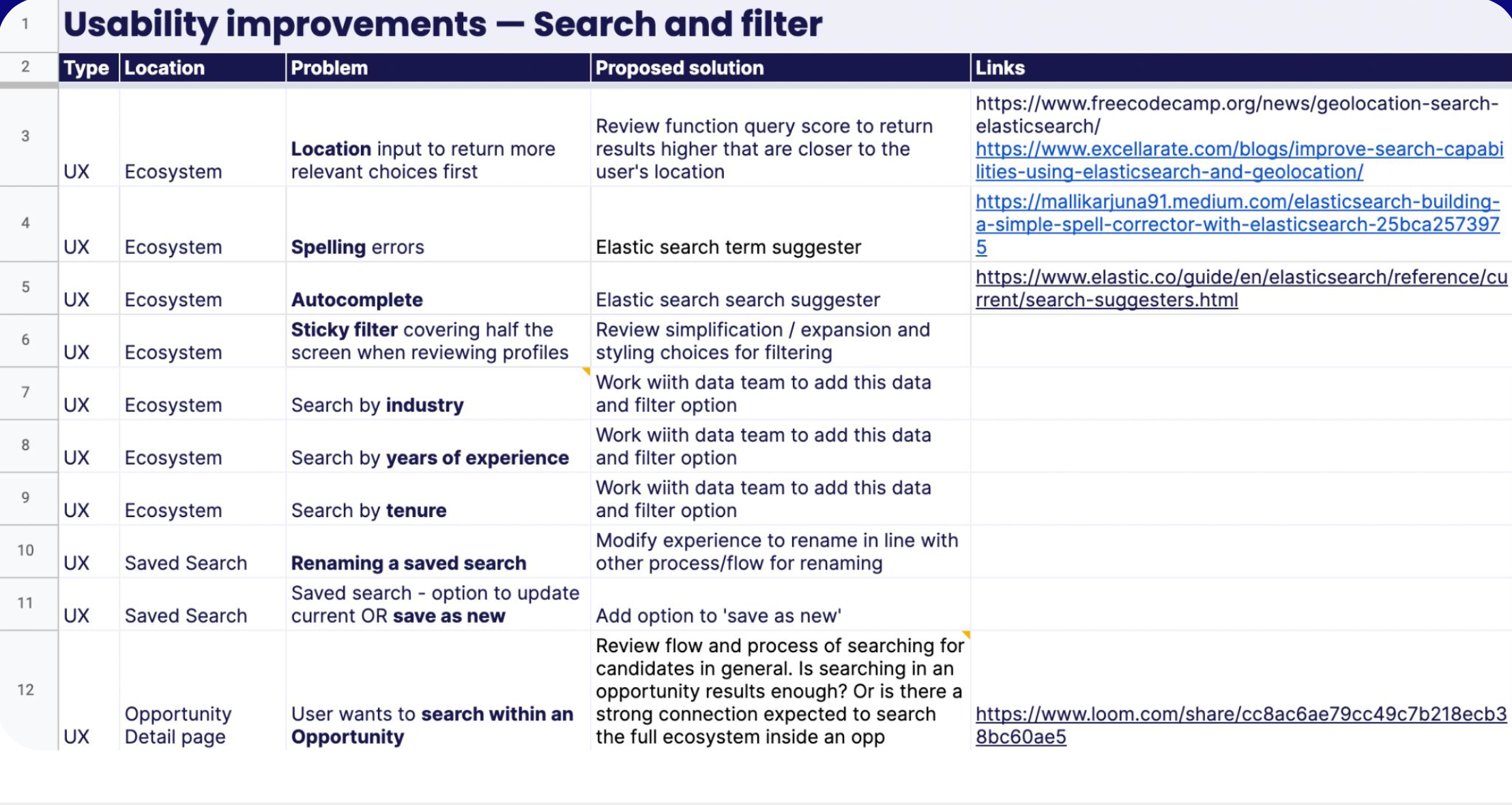
Synthesis — Key themes, insights & recommendations
From discovery, I pulled together the core findings. This is where I narrowed in on the core problems to solve now, based on an effort v impact analysis.
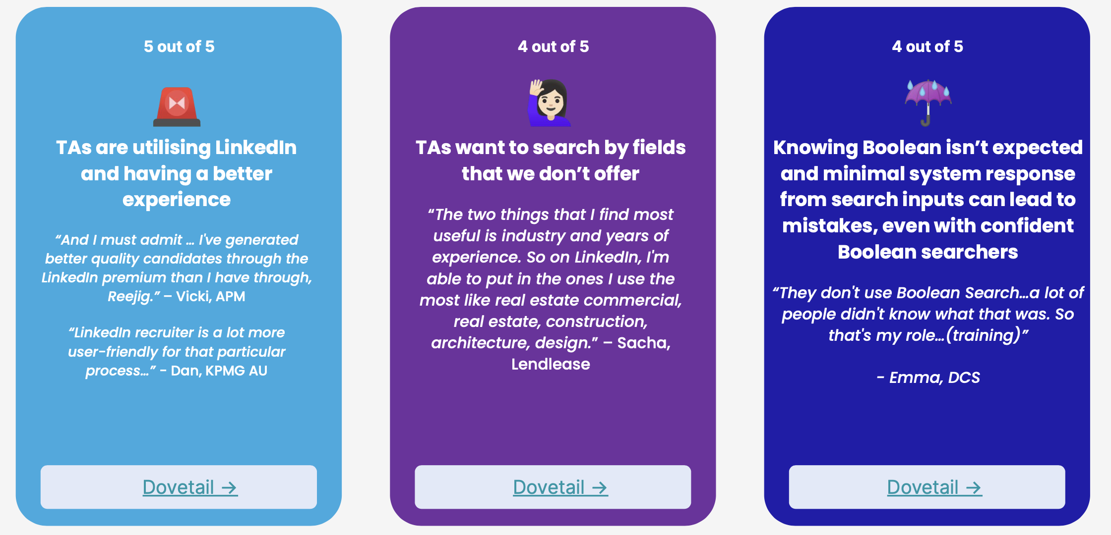
Ideation
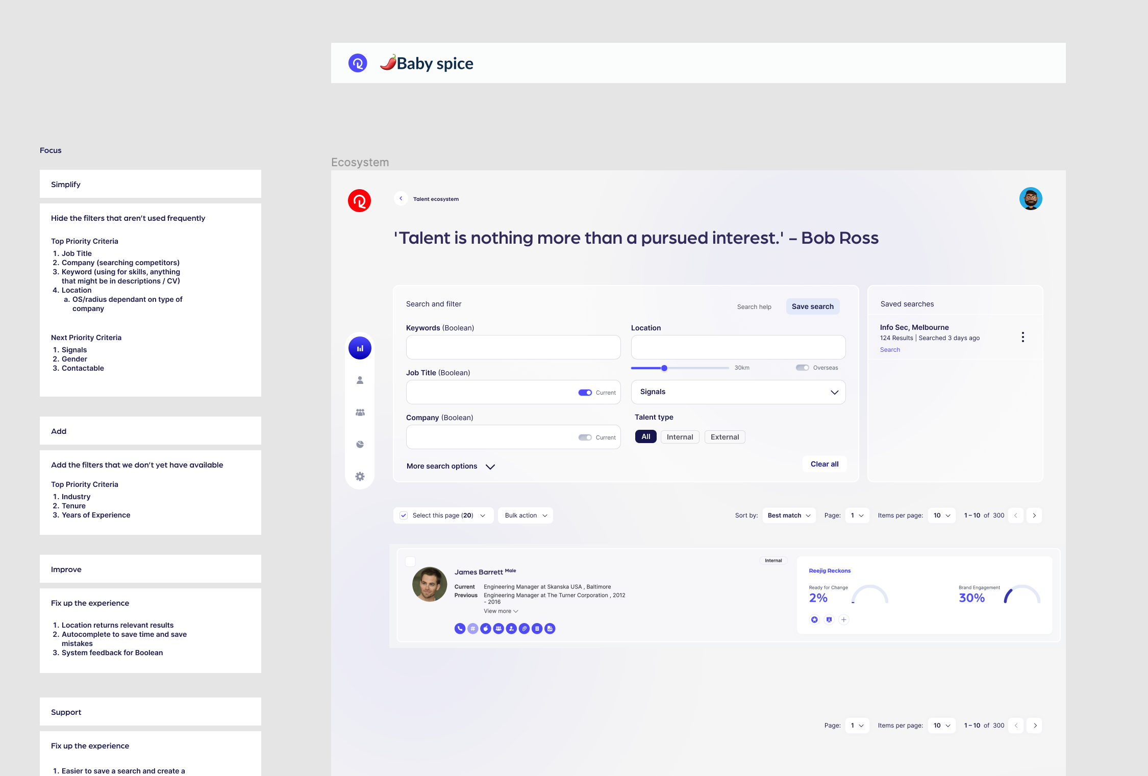
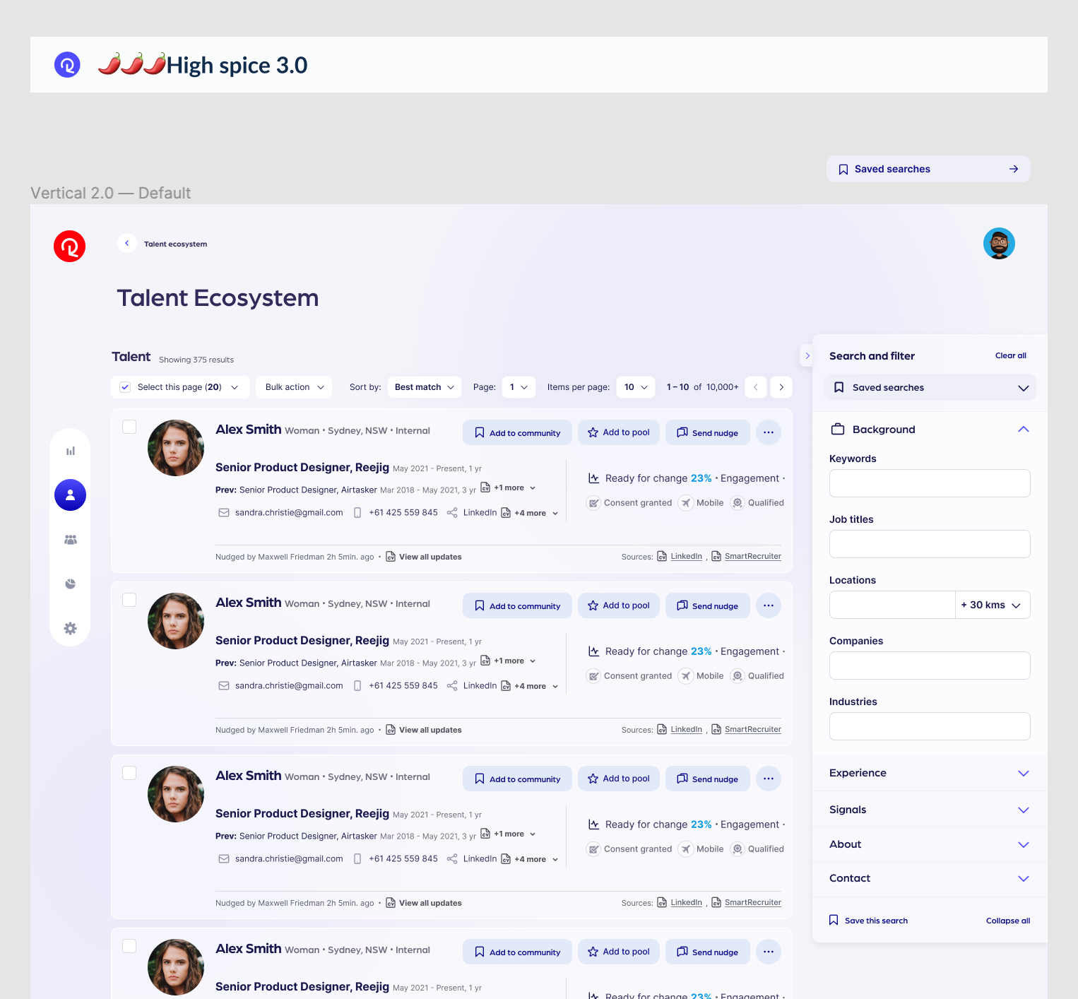
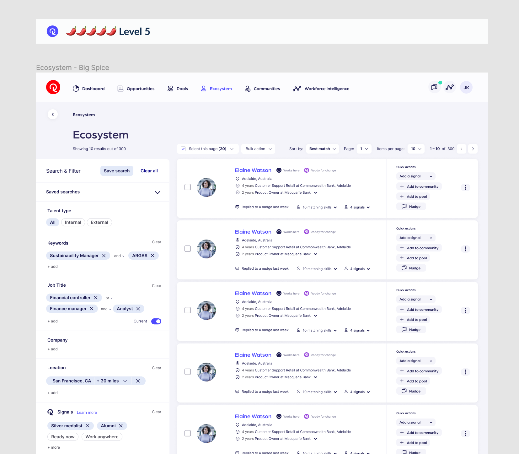
Working through various approaches from minimal change to bold and creative.
Creating and ideating through multiple approaches to solve core outcomes of research
I love to be bold, go wide and really push the concepts in ideation. I am a fan of bold ideas first, to explore the what if and what might be possible.
I find I am quite creative in this space and tend to come up with ideas that reflect best practice and standard patterns, but also take things a step further and help to innovate in new ways to solve a problem.
I also look at the simplest approaches as well to understand the contrast between a minimal effort that might be quicker to implement but may not solve the core problem. This can help in communicating the value of a bold idea or can help us understand that a quicker approach may be better suited right now.
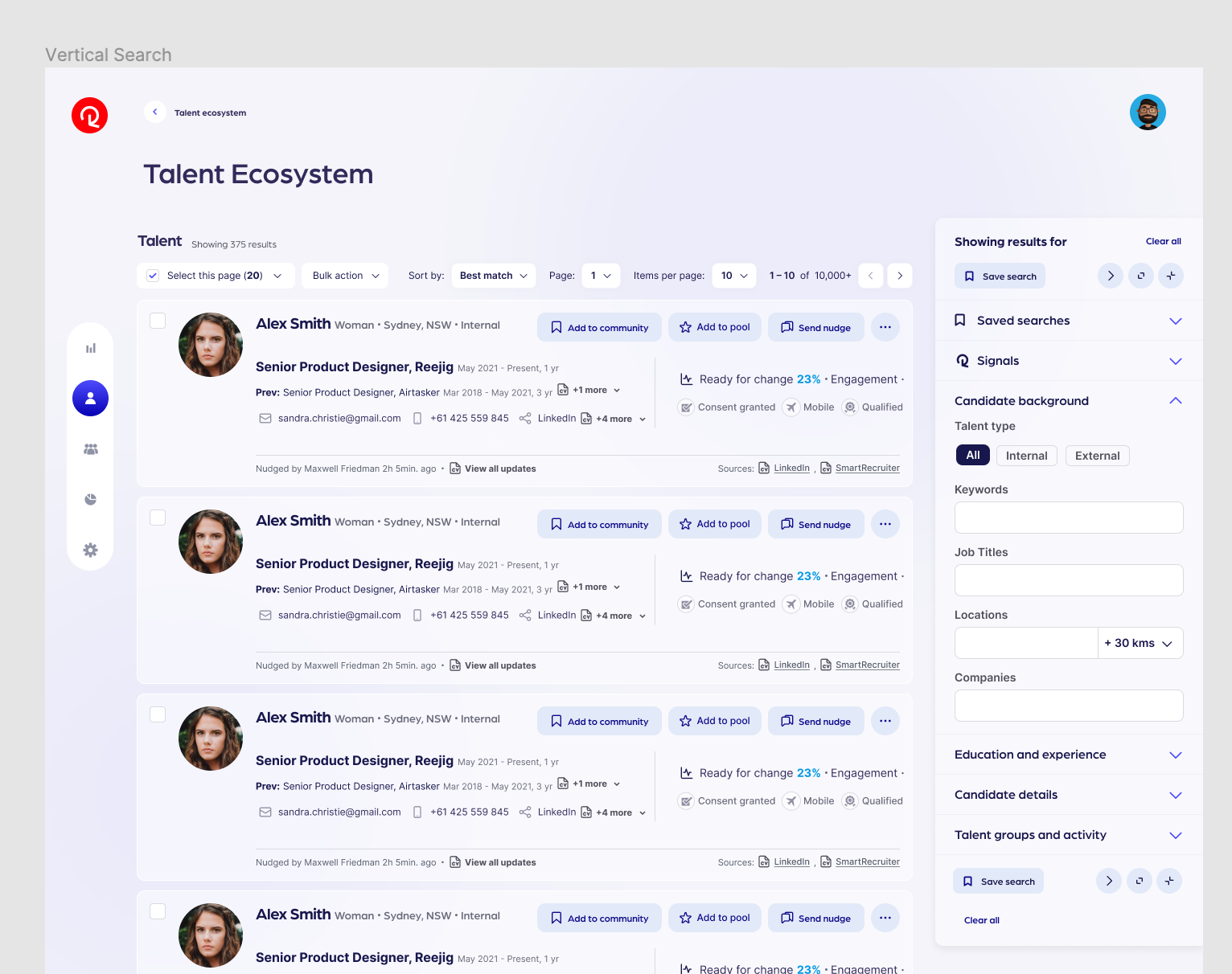
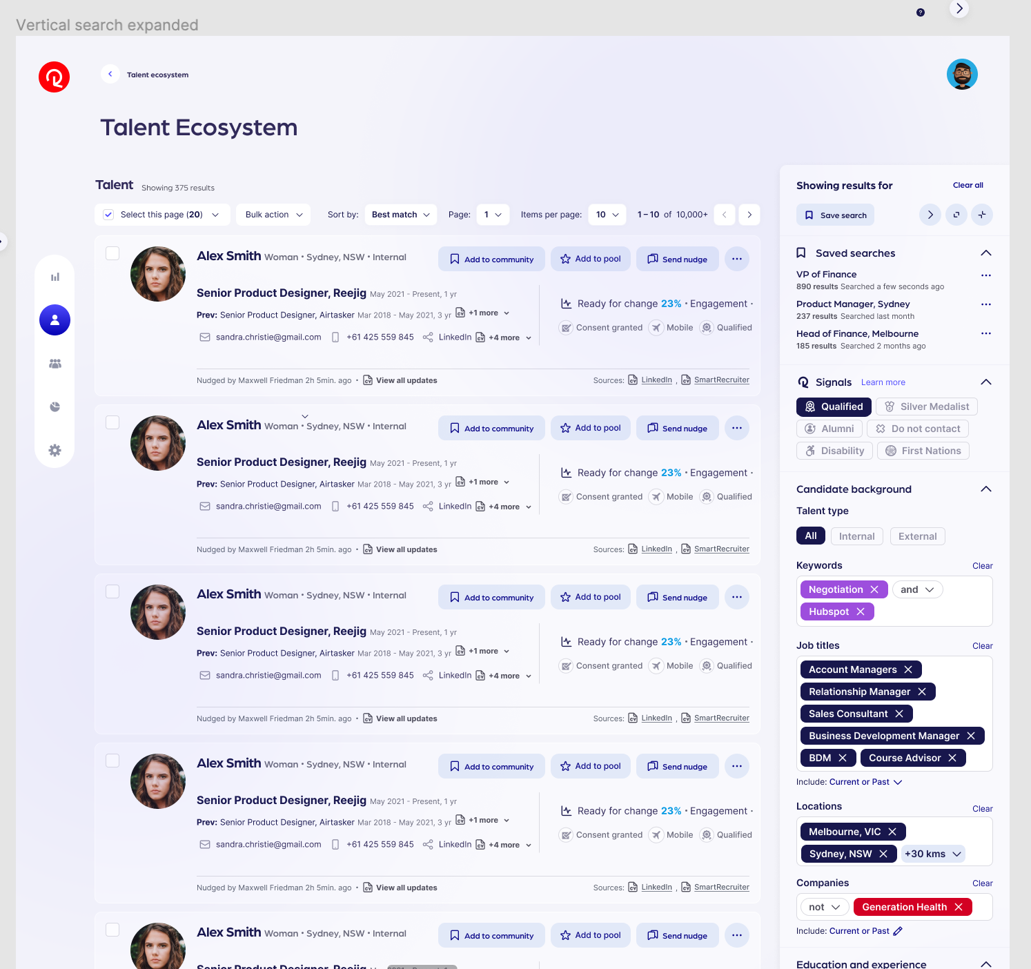
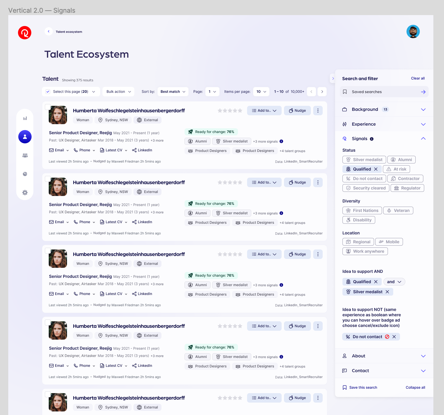
A small sample of ideation
Navigating from quick, less impactful solutions through to larger-scale ideas that have the opportunity for greater impact and value.
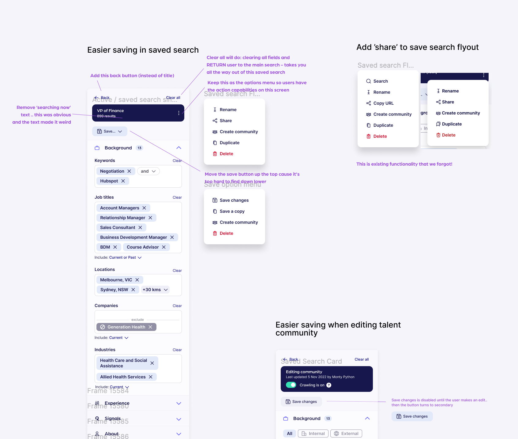
Internal critique and collaboration
Through a few rounds of internal feedback from the design team, Head of PX and engineering collaboration, I locked down the final direction for design
This decision is based off of coming back to our research findings, understanding effort v impact and consensus and alignment across teams
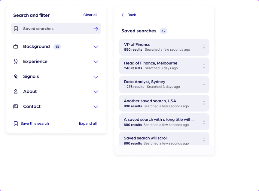
There were countless layers, components and choices to be made in this search experience: system feedback and autocomplete, saved search experience, how to use Boolean operators, how to display signals, how to search all or current, how to do location search, how to do a multi-tier, multi select + more
Exploring a key feature —
Reejig Refine
Reejig Refine, a bespoke approach to limit, broaden and define search
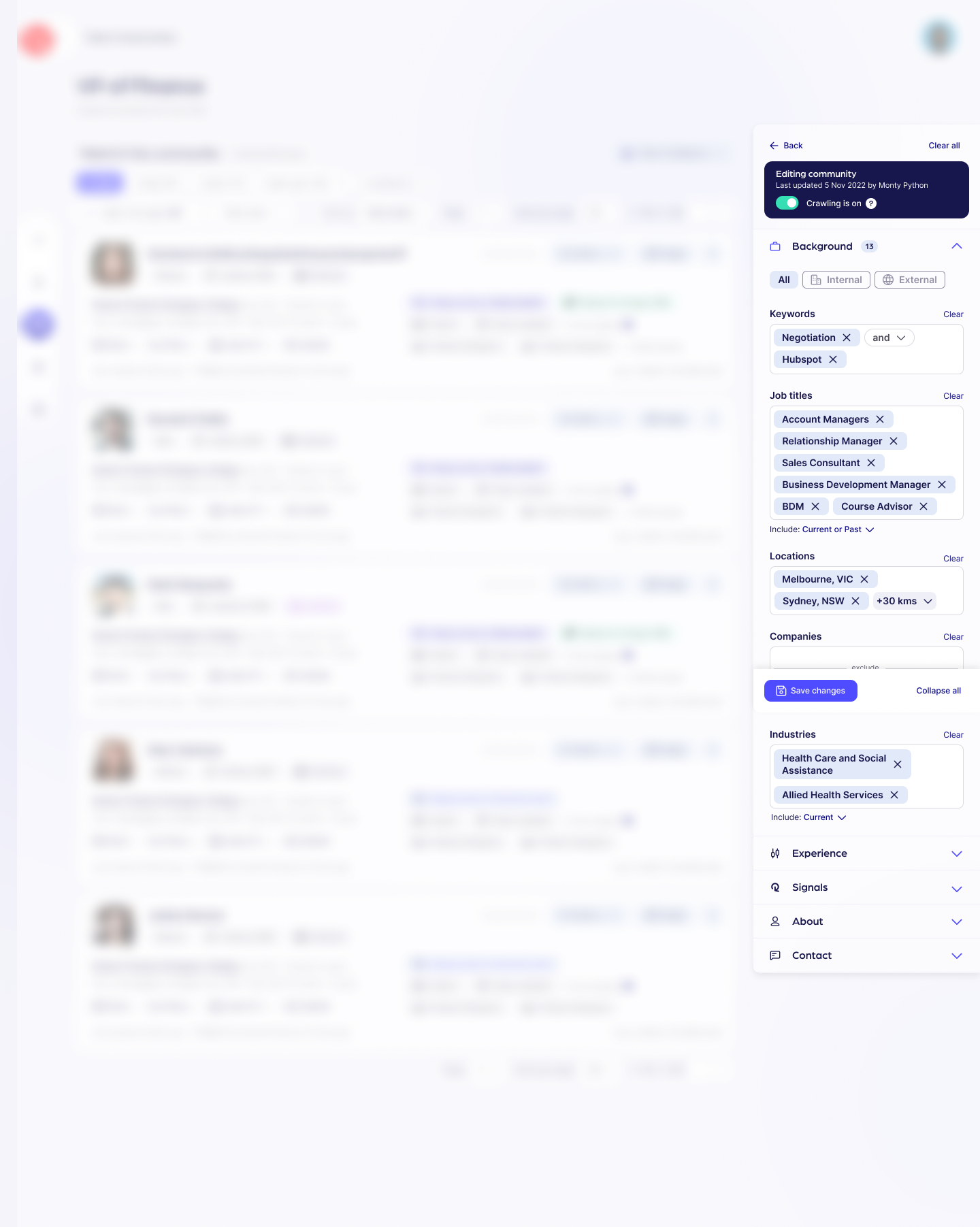
Reejig Refine was the end result of ideation to support Boolean search capability without requiring users to be experts in this function
I started with exploring new patterns that could enable users to toggle the core operators, ““, AND, OR and NOT
The first iteration used a cancel symbol to exclude a search term and a dropdown to choose AND or OR
After a quick round of usability testing, I thought that simplifying the approach down could prove to be more effective and less complex. This led to transitioning to a “Refine” dropdown on the outside of the field to choose the operators.
Rollout of the final solution was paired with some learning and training materials supported by the CS team as well as updated product documentation
We also closely monitored the experience through sessions recordings and product analytics and were super happy to see engagement and use go very well
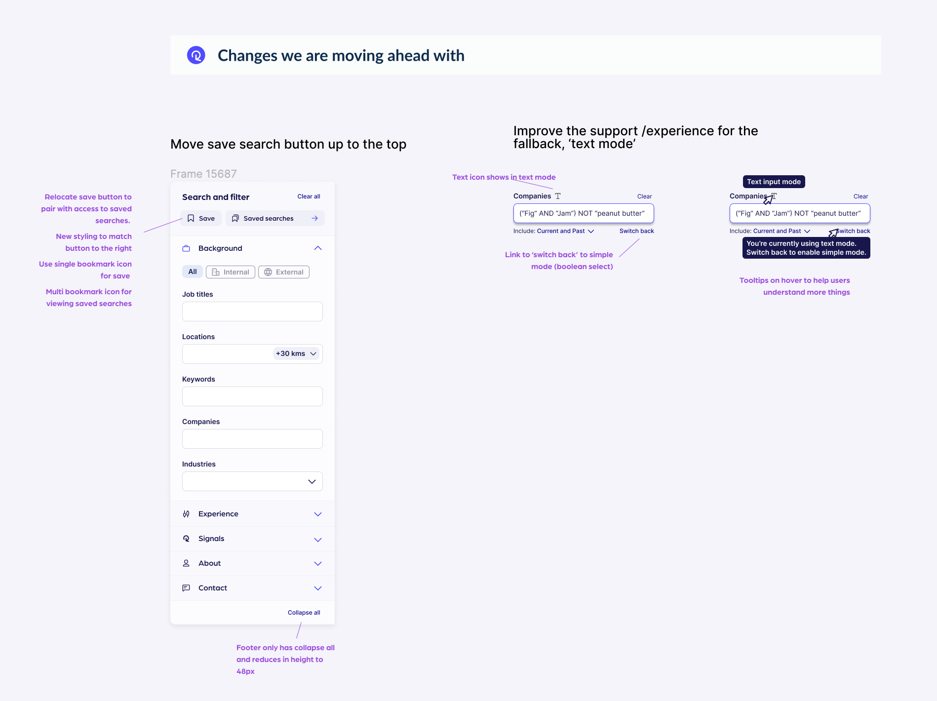
Because our research did highlight a small segment of users who did like to use the standard text approach to Boolean, I strategised a ‘fallback’ method that users could toggle on to still use the standard text input.
Prototypes and Usability Testing
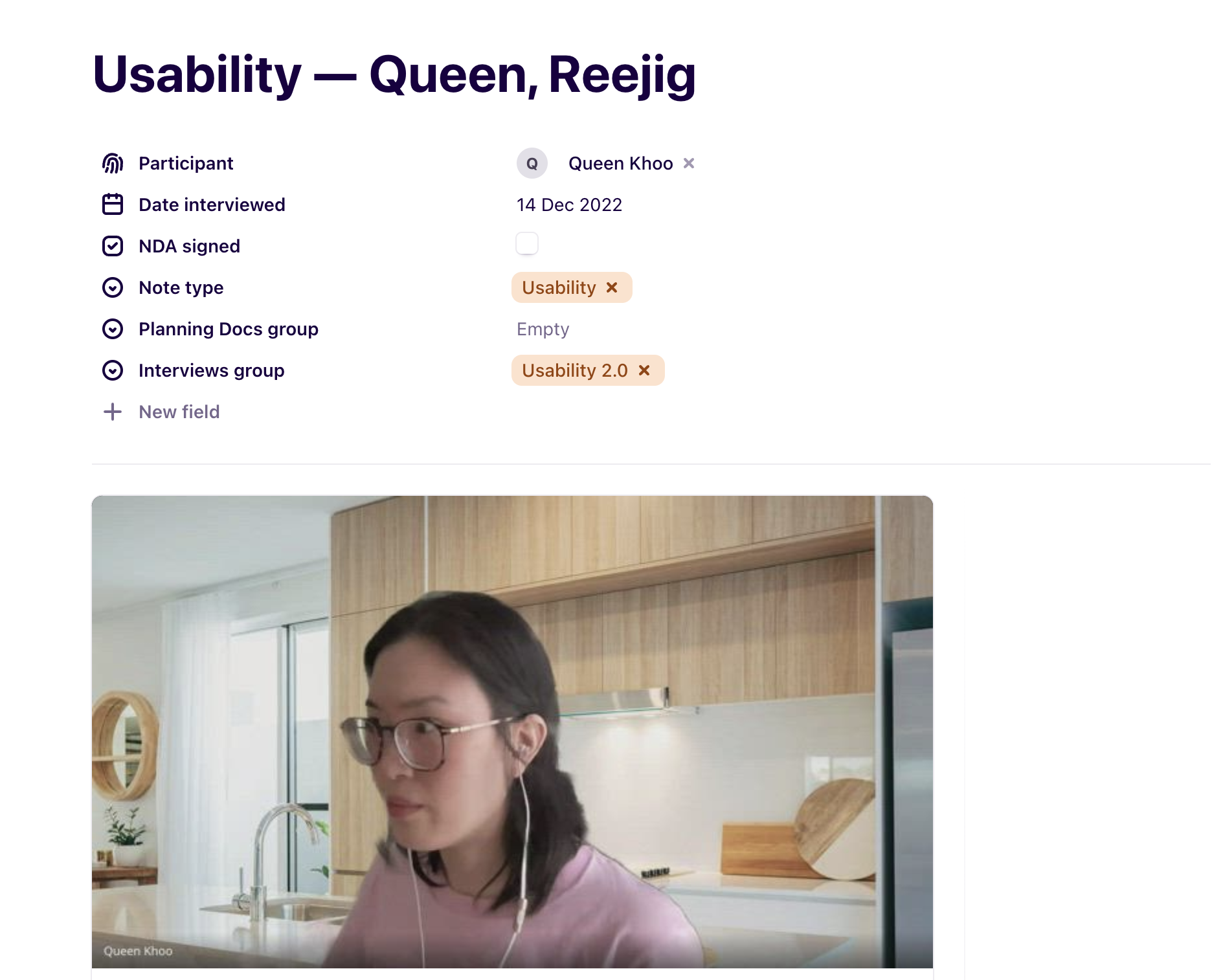
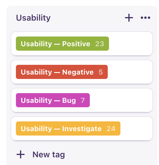
Virtual usability sessions with CS team and users
Testing designs for usability and desirability
Is the new design functional, desirable, and usable? Walking internal folks from CS and users through a guided usability test helps us understand if we are solving the problem and if we can still do it better.
Are we solving the problem?
What can be improved?
What can be removed?
Is anything missing?
High Fidelity Design
Collaboration with engineers to tweak interaction, prioritise performance and work through any remaining states
To me, the polish of a design comes from the inbetween .. the full experience and how one element interacts and flows to the next, what happens when things go wrong, how to support unsavoury states, etc
I also took a look at how and where we would be evolving the foundations of the design system and made plans with the team to create custom components or extend existing ones
With our final designs, we undertook a short beta release with a few customers which enabled us to tweak and adjust a few interactions and styles for easier use and simplicity.
Through clear and close collaboration with engineers and data, we focused on planning and alignment for how elements and interactions should and could behave.
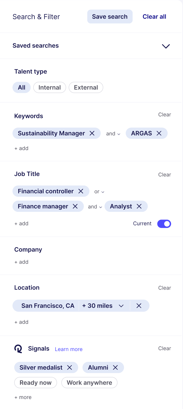
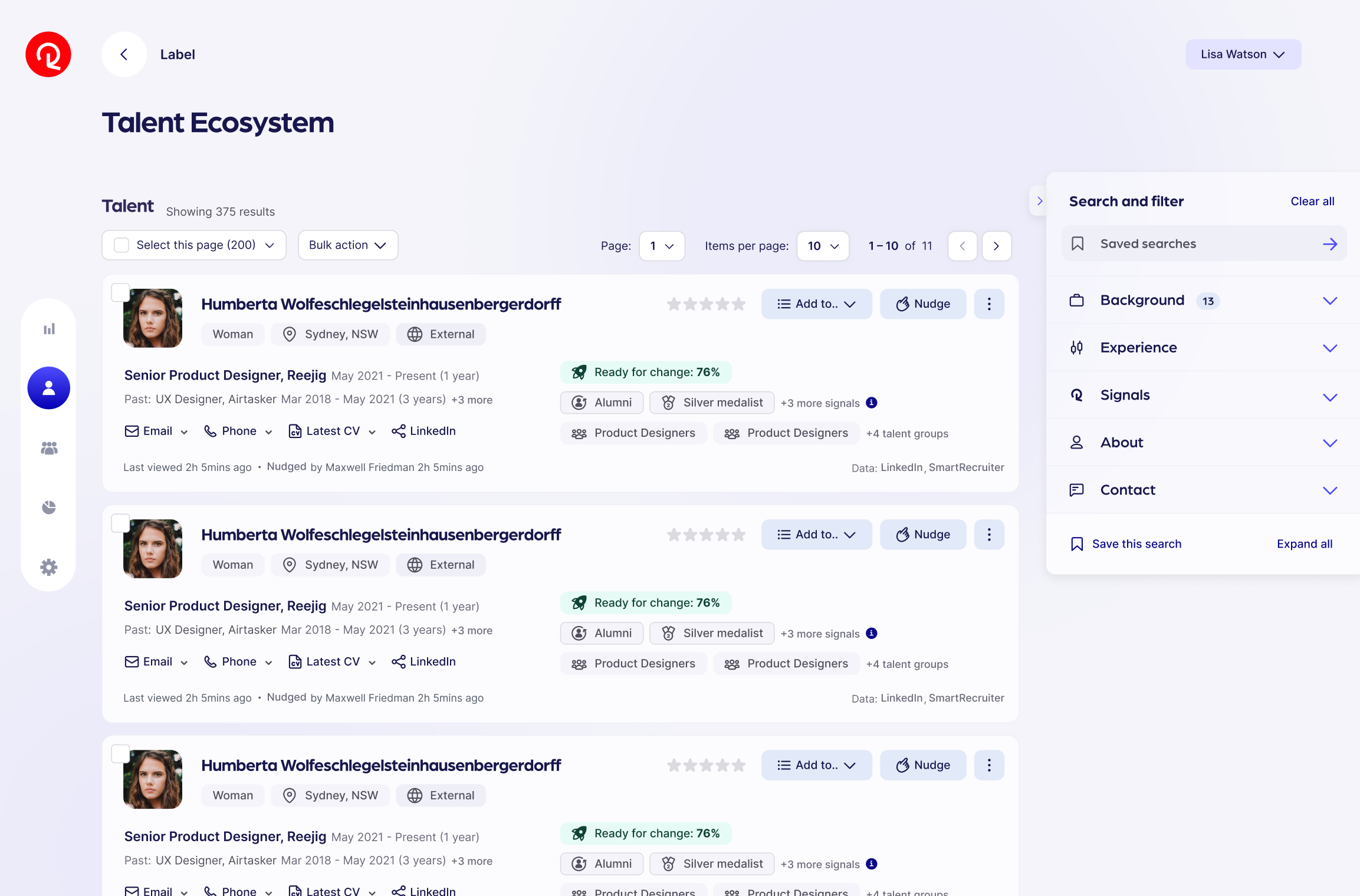
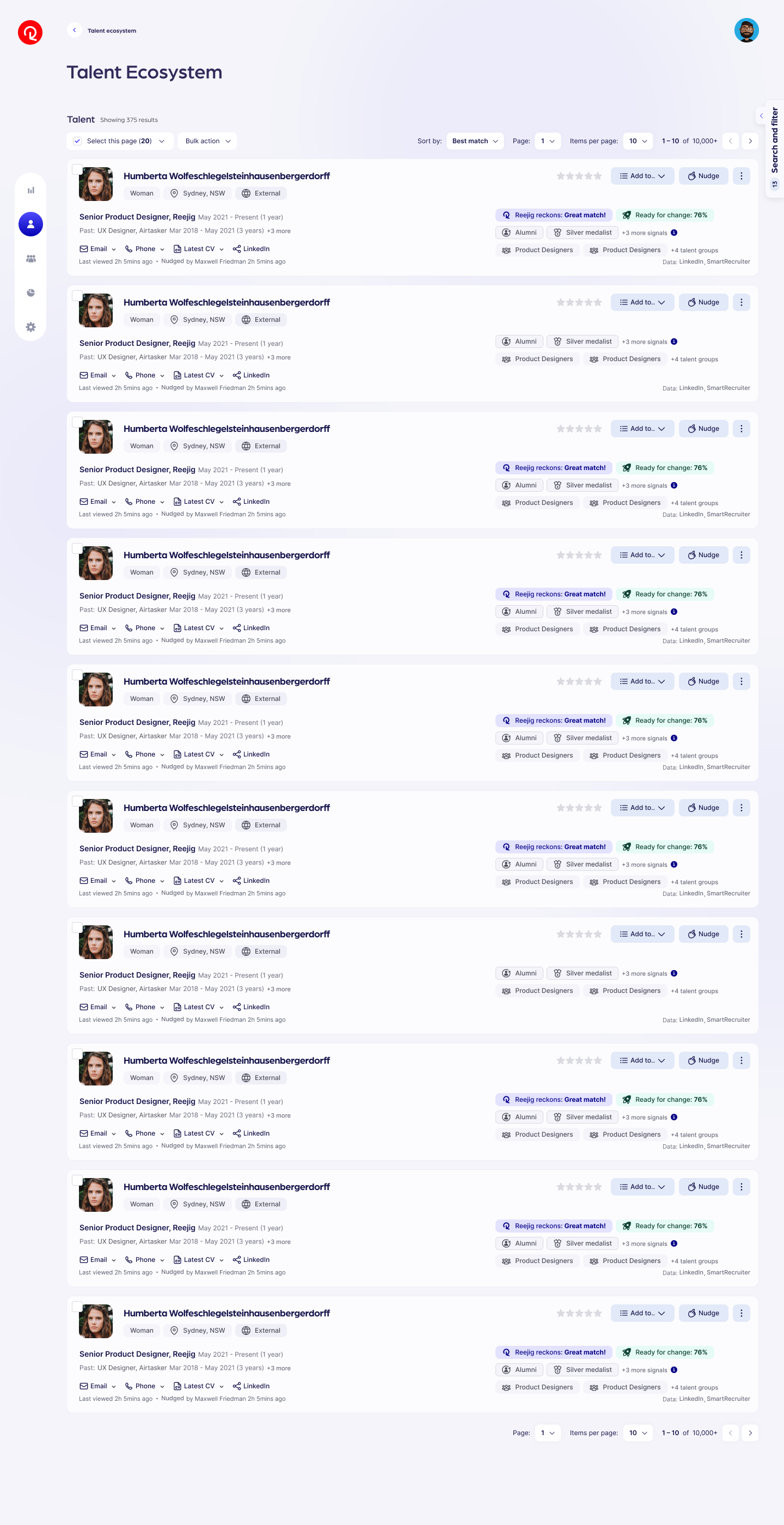
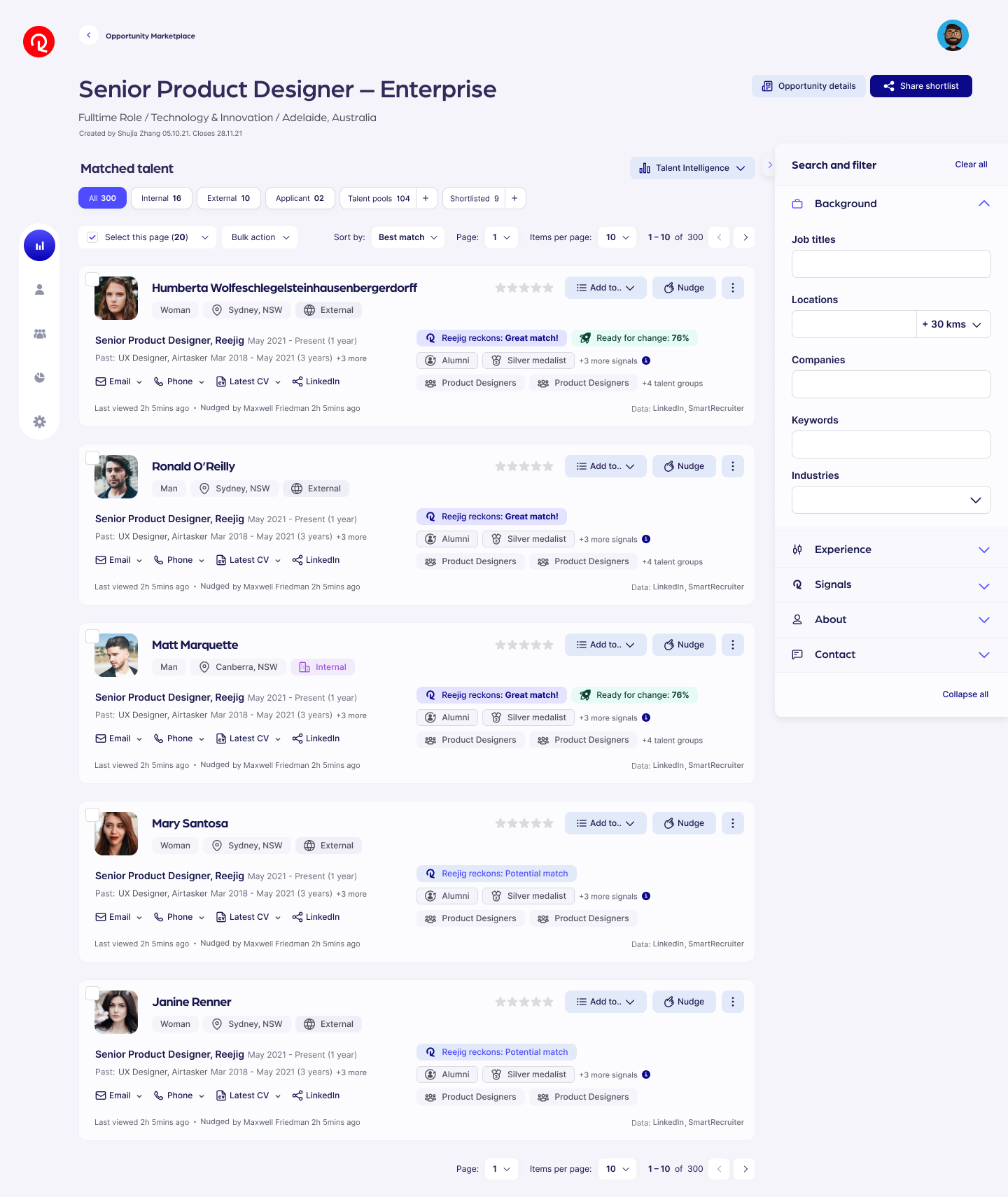
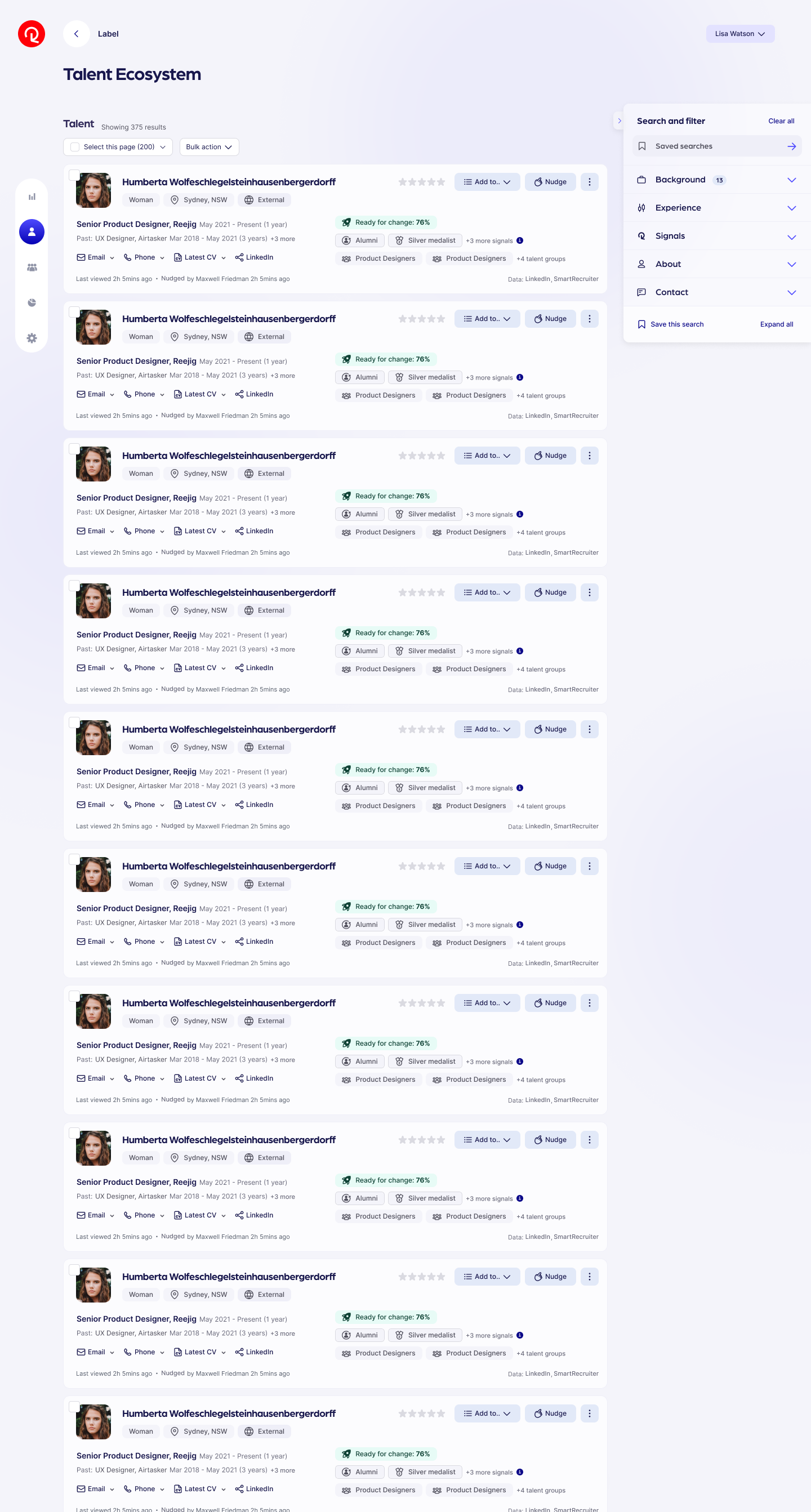
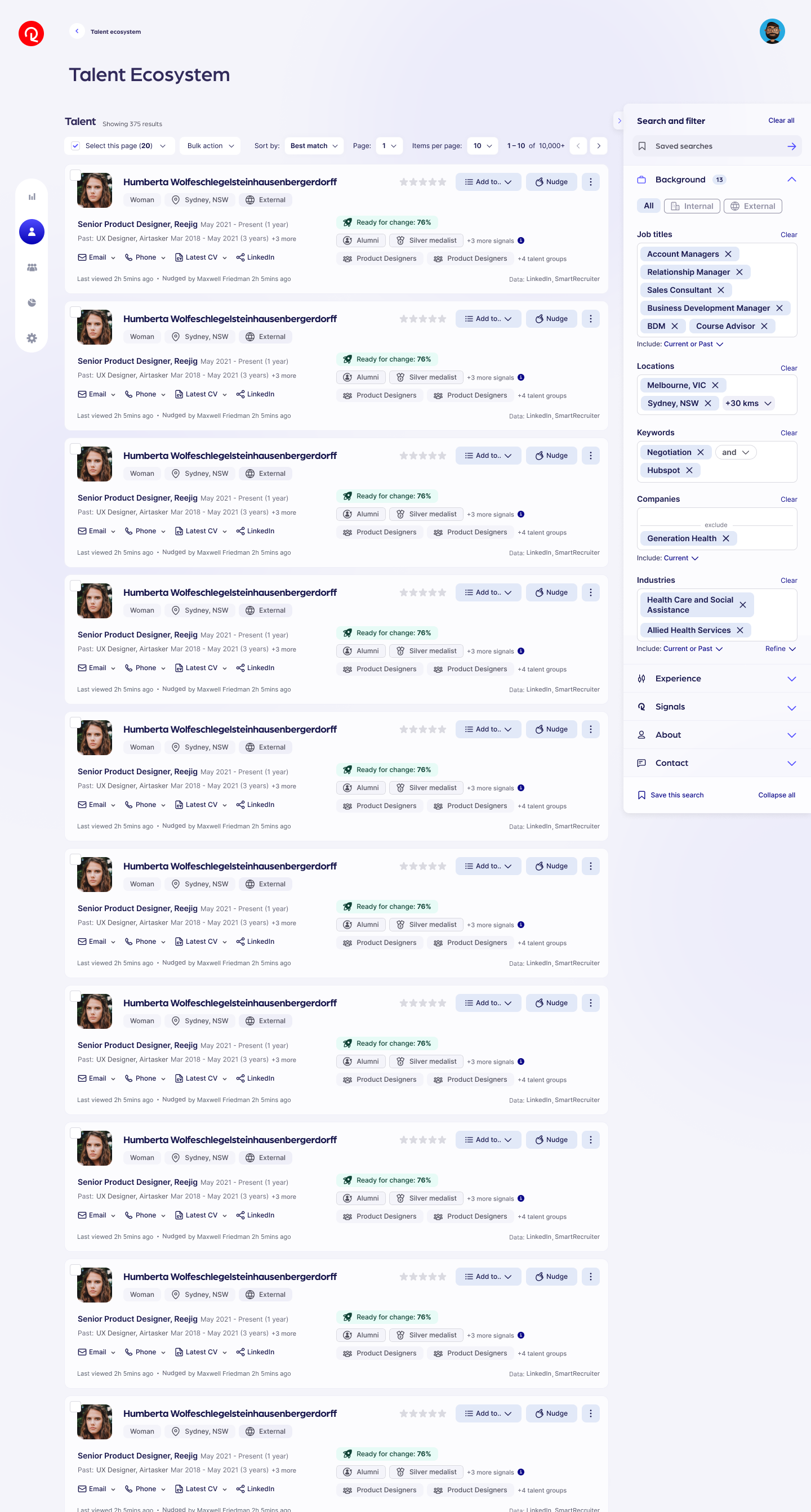
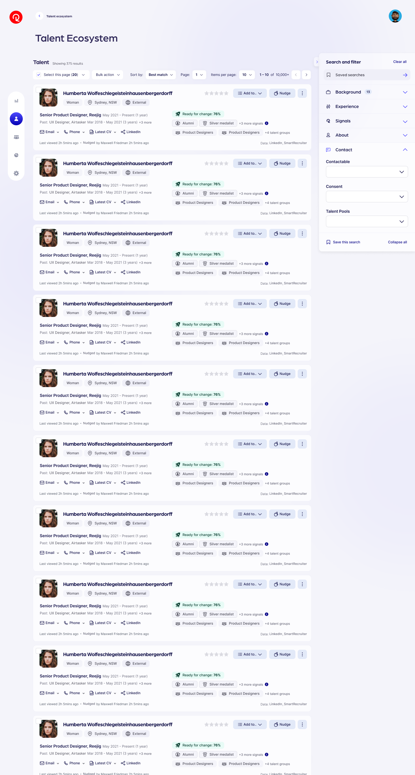
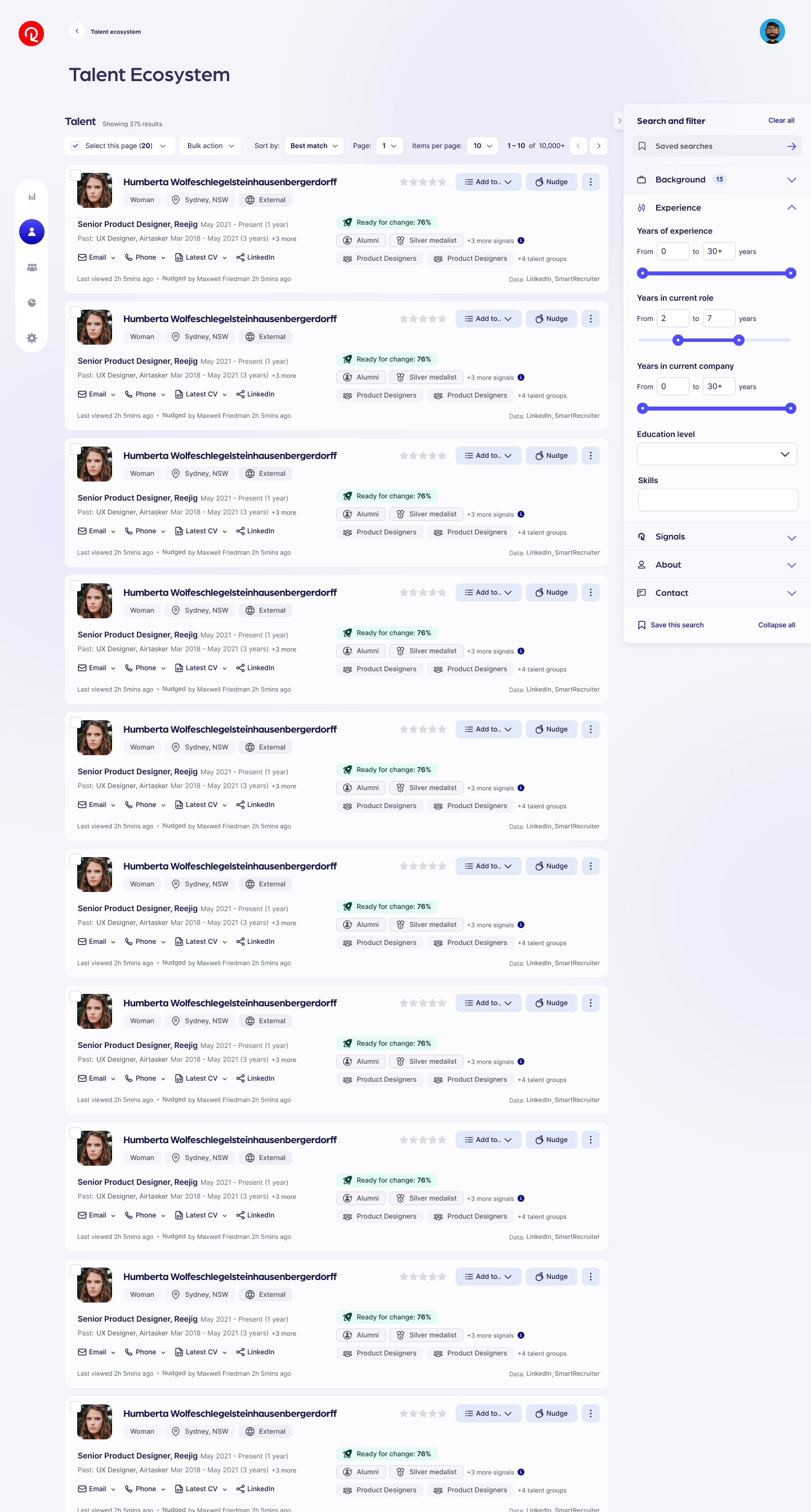
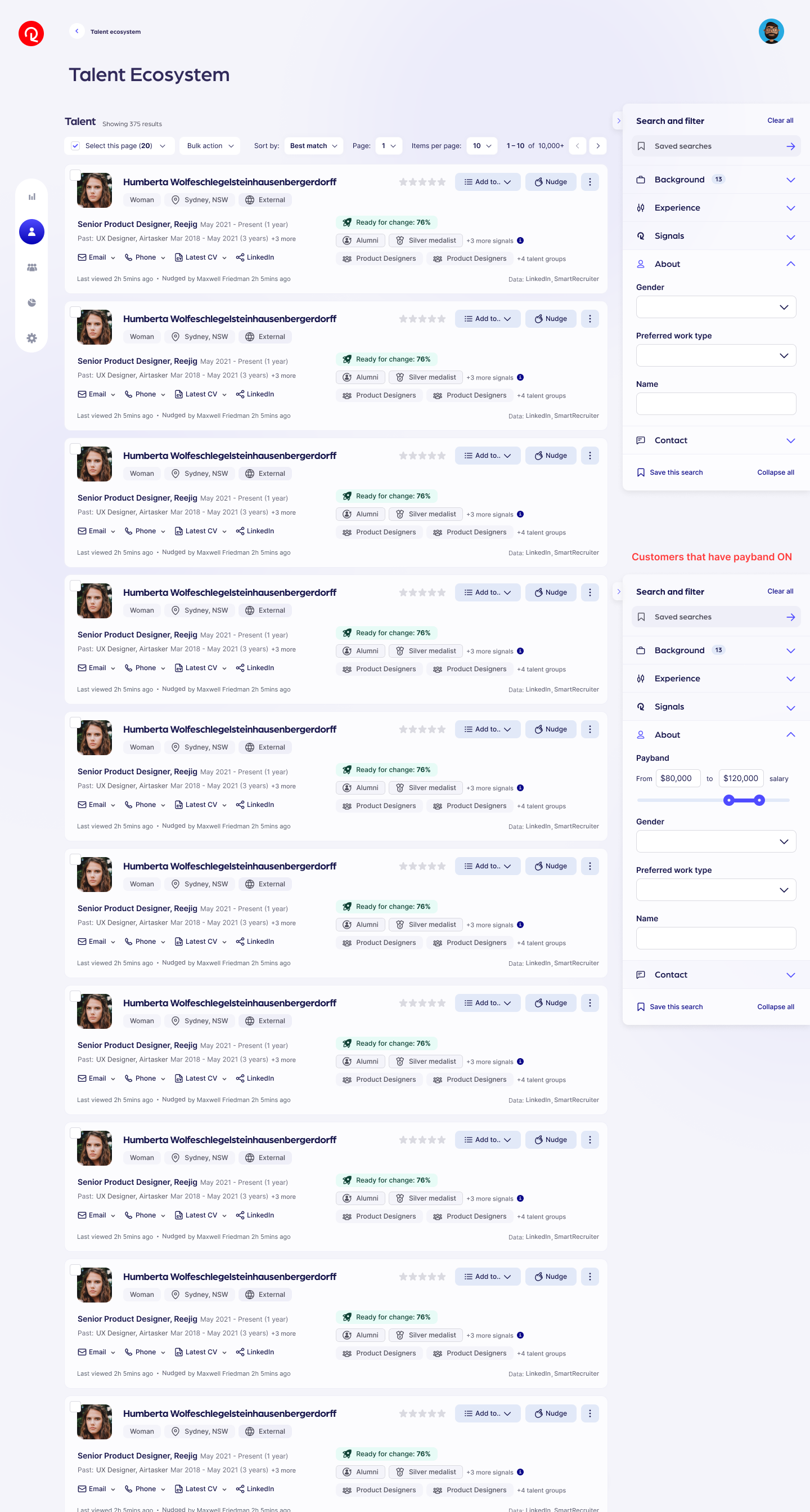
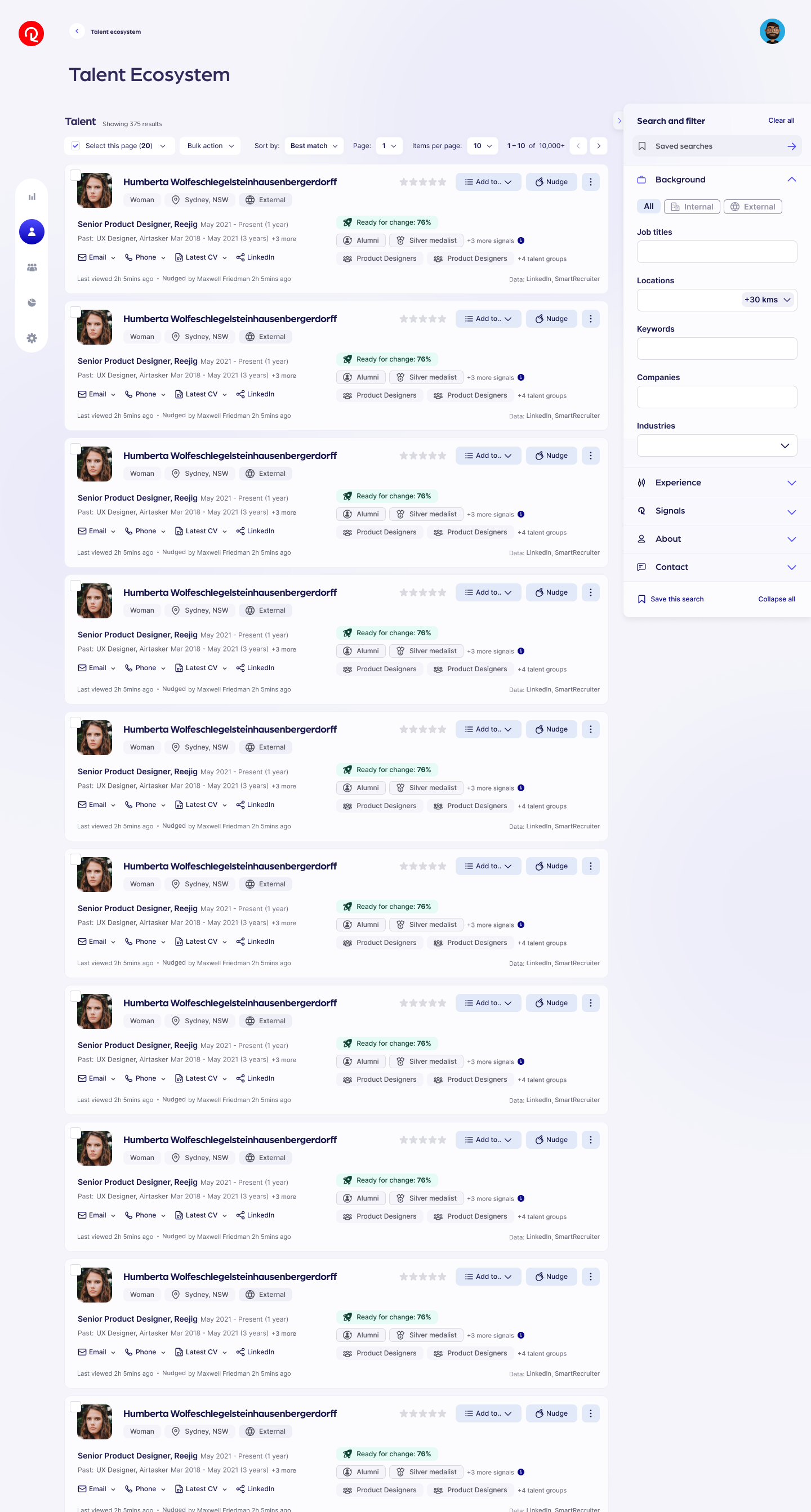
Reejig Refine — my solution to simplify and remove the need for users to manually input long boolean search strings
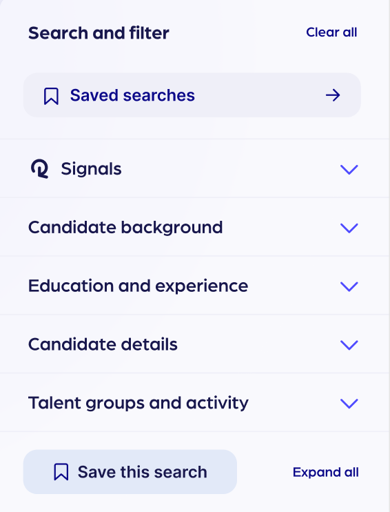
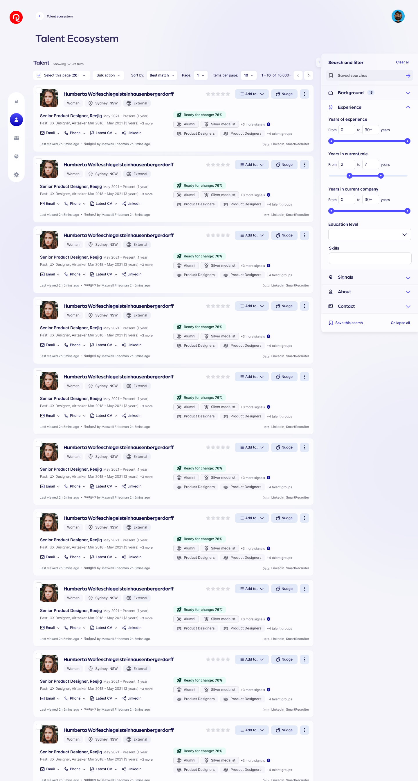
Moving search to the side of the page rather than top enabled users to have more more screenspace to view results
Release, Support and Iteration
Supporting product release across Customers, CS, Marketing and more
While build was underway, I was not only paired with engineers to collaborate on dev, but I also focused on crafting a release plan to ensure that such significant product change would be well supported internally and with customers.
I created assets such as GIFs, video walkthroughs, imagery and I also wrote the copy for marketing comms
I setup internal sessions to walk through new product functionality with CS and marketing
Recorded looms and wrote documentation
Setup new dashboards and metrics in Fullstory to start tracking outcomes
We had a number of additional features and functionality that we were releasing in following sprints, so as we tacked success from this first release, we continued ahead with additional functionality.
Outcomes
Improving the talent search and filter experience in Reejig
By reducing frustration and friction when searching for talent, we were able to significantly impact the core experience of finding and managing talent:
~200% increase in proportion of users active and engaging in ecosystem (compared to previous quarter)
~300% increase in active time on page in Ecosystem (compared to previous quarter)
50 sessions using bespoke ‘Refine’ feature (in first 7 days)
173 saved searches (in first 7 days)
18 saved communities (in first 7 days)
Learnings & Understanding Success
The research highlighted the size and complexity of our current solution — it was terrible and almost unusable. So we engaged with stakeholders to strategically roll out a significant overhaul.
Not only did we rebuild the search component, but we also added multiple new search inputs, re-designed the saved search experience, added autocomplete results, designed a bespoke feature to enable complex search with ease, and also created the flow and experience for search across 4 unique sections of our product.
During ideation, we discovered additional and significant hurdles from bespoke customer solutions and tech debt — all areas we strategically brought forward for planning and review in future sprints.
By tracking our outcomes through direct customer feedback and product analytics, we were able to understand a substantial and significant increase in engagement and completion of core search actions.
It was the first time our squad came together, so we first needed a little time to build ways of working and to establish good rhythm. A good reminder of the impact of building a strong team foundation.
Prior to this project, our squad had minimal knowledge working with ElasticSearch, so building understanding of this technology helped enable all of us to build a more robust solution. Prioritising the time to upskill and learn was important.
I’m most proud of the visual simplicity in our final solution, but with a depth of complexity and and capability underneath the hood. It was a great exercise in uncovering a lot of unknowns and iterating towards a simple interface with powerful capability.
Off the back of our core release, we had a few more cascading sprints to continue to evolve the solution and kickoff discovery that could support some of the additional learnings found in discovery.
Thank you